5 Panel Data and Difference-in-Differences
When we can observe and measure potentially confounding factors, we can recover causal effects by controlling for these factors. Often, however, confounders may be difficult to measure or impossible to observe. If this is the case, we need alternative strategies for estimating causal effects. One approach is to try to obtain data with a time dimension, where one group receives a treatment at a given point in time but the other group does not. Comparing the differences between pre- and post-treatment periods for these two groups allows us to control for unobserved omitted variables that are fixed over time. Under certain assumptions, this can produce valid estimates of causal effects.
Chapter 5 in MHE gives a very good treatment of the main empirical issues associated with difference-in-differences analysis, and with panel data more generally. The relevant chapter in Mastering ’Metrics is especially good for this week, so both are worth consulting.
The papers by Card (1990) and Card and Krueger (1994) are classics in the diff-in-diff literature, and give a very intuitive overview of the basics behind the method. More advanced applications can be found in the paper by Ladd and Lenz (2009), which also provides a useful demonstration of how difference-in-difference analyses can be combined with matching in order to strengthen the parallel trends assumption, and the recent paper by Dinas et al (2018), which we will replicate in part below.
An example of using fixed-effect regression to estimate a difference-in-differences type model can be found in the paper by Blumenau (2019).
For those of you who are feeling very committed, an important paper on statistical inference for difference-in-difference models is this one by Bertrand et. al. (2004). Be warned, however, that essentially no-one has ever enjoyed time spent reading a paper that is almost entirely about standard errors.
5.1 Seminar
This week we will be learning how to implement a variety of difference-in-differences estimators, using both linear regression and fixed-effects regressions. We will also spend time learning more about R’s plotting functions, as visually inspecting the data is one of the best ways of assessing the plausibility of the “parallel trends” assumption that is at the heart of all difference-in-differences analyses.
Data
We will use two datasets this week. The first is from a paper by Dinas et. al. (2018) which examines the relationship between refugee arrivals and support for the far right. The second is from a classic paper by Card and Krueger (1994) which examines the effects of changes in the minimum wage on employment. Both can be downloaded using the links at the top of the page.
5.1.1 Refugees and support for the far right – Dinas et. al. (2018)
The recent refugee crisis in Europe has conincided with a period of electoral politics in which right-wing extremist parties have performed well in many European countries. However, despite this aggregate level correlation, we have surprisingly little causal evidence on the link between influxes of refugees, and the attitudes and behaviour of native populations. What is the causal relationship between refugee crises and support for far-right political parties? Dinas et. al. (2018) examine evidence from the Greek case. Making use of the fact that some Greek islands (those close to the Turkish border) witnessed sudden and unexpected increases in the number of refugees during the summer of 2015, while other nearby Greek islands saw much more moderate inflows of refugees, the authors use a difference-in-differences analysis to assess whether treated municipalites were more supportive of the far-right Golden Dawn party in the September 2015 general election. We will examine the data from this paper, replicating the main parts of their difference-in-differences analysis.
The dinas_golden_dawn.Rdata file contains data on 96 Greek municipalities, and 4 elections (2012, 2013, 2015, and the treatment year 2016). The muni data.frame contained within that file includes the following variables:
treatment– This is a binary variable which measures 1 if the observation is in the treatment group (a municipality that received many refugees) and the observation is in the post-treatment period (i.e. in 2016). Untreated units, and treatment units in the pre-treatment periods are coded as zero.ever_treated– This is a binary variable equal toTRUEin all periods for all treated municipalities, and equal toFALSEin all periods for all control municipalities.trarrprop– continuous (per capita number of refugees arriving in each municipality)gdvote– the outcome of interest. The Golden Dawn’s share of the vote. (Continuous)year– the year of the election. (Can take 4 values: 2012, 2013, 2015, and 2016)
Use the load function to load the downloaded data into R now.
- Using only the observations from the post-treatment period (i.e. 2016), implement a regression which compares the Golden Dawn share of the vote for the treated and untreated municipalities. Does the coefficient on this regression represent the average treatment effect on the treated? If so, why? If not, why not?
post_treatment_data <- muni[muni$year == 2016,]
post_treat_mod <- lm(gdvote ~ treatment,data = post_treatment_data)

texreg::screenreg(post_treat_mod)
##
## ======================
## Model 1
## ----------------------
## (Intercept) 5.66 ***
## (0.25)
## treatment 2.74 ***
## (0.71)
## ----------------------
## R^2 0.14
## Adj. R^2 0.13
## Num. obs. 96
## ======================
## *** p < 0.001; ** p < 0.01; * p < 0.05The treatment variable is a dummy measuring 1 for treated observations in the post-treatment period, and zero otherwise. This means that the regression estimated above is simply the difference in means (for support for the Golden Dawn) between the treatment group (municipalities that witnessed large inflows of refugees) and the control group (municipalities that did not receive large numbers of refugees). The difference in means is positive, and significant: treated municipalities on average were 2-3 percentage points more supportive of the Golden Dawn than non-treated municipalities in the post-treatment period. Notice that for this simple analysis, you would have produced exactly the same result by using the ever_treated variable rather than the treatment variable.
However, because the treatment was not assigned at random, we have little reason to believe that this difference in means would identify the causal effect of interest. The treated and control municipalities might very well have different potential outcomes, and so selection bias is – as always – a concern.
- Calculate the sample difference-in-differences between 2015 and 2016. For this question, you should calculate the relevant differences “manually”, in that you should use the
meanfunction to construct the appropriate comparisons. What does this calculation imply about the average treatment effect on the treated?
# Calculate the difference in means between treatment and control in the POST-treatment period
post_difference <- mean(muni$gdvote[muni$ever_treated == T & muni$year == 2016]) -
   mean(muni$gdvote[muni$ever_treated == F & muni$year == 2016])
post_difference
## [1] 2.744838# Calculate the difference in means between treatment and control in the PRE-treatment period
pre_difference <- mean(muni$gdvote[muni$ever_treated == T & muni$year == 2015]) -
mean(muni$gdvote[muni$ever_treated == F & muni$year == 2015])
pre_difference## [1] 0.6212737# Calculate the difference-in-differences
diff_in_diff <- post_difference - pre_difference
diff_in_diff## [1] 2.123564Note that because the treatment variable only indicates differences in treatment status during the post-treatment period, here we need to use the ever_treated variable to define the difference in means in the pre-treatment period.
The difference in means in the post-treatment period (2.74) is larger than the difference in means for the pre-treatment period (0.62), implying that the average treatment effect on the treatment municipalities is positive. In simple terms, the difference-in-difference implies that the refugee crisis increased support for the Golden Dawn amongst treated municipalities by rougly 2 percentage points, on average.
- Use a linear regression with an appropriate interaction term to estimate the difference-in-differences. For this question, you should again focus only on the years 2015 and 2016. Note: To run the appropriate interaction model you will first need to convert the
yearvariable into an appropriate dummy variable, where observations in the post-treatment period are coded as 1 and observations in the pre-treatment period are coded as 0.
# Subset the data to observations in either 2015 or 2016
muni_1516 <- muni[muni$year >= 2015,]

# Construct a dummy variable for the post-treatment period. Note that the way it is
# constructed the variable in R means it is stored as a logical vector (of TRUE and FALSE
# observations) rather than a numeric vector. R treats logical vectors as dummy variables,
# with TRUE being equal to 1 and FALSE being equal to 0.
muni_1516$post_treatment <- muni_1516$year == 2016

# Calculate the difference-in-differences
interaction_mod <- lm(gdvote ~ ever_treated * post_treatment, data = muni_1516)
interaction_mod2 <- lm(gdvote ~ ever_treated + post_treatment + treatment, data = muni_1516)

texreg::screenreg(list(interaction_mod,interaction_mod2))
##
## ===========================================================
## Model 1 Model 2
## -----------------------------------------------------------
## (Intercept) 4.39 *** 4.39 ***
## (0.24) (0.24)
## ever_treatedTRUE 0.62 0.62
## (0.68) (0.68)
## post_treatmentTRUE 1.27 *** 1.27 ***
## (0.34) (0.34)
## ever_treatedTRUE:post_treatmentTRUE 2.12 *
## (0.97)
## treatment 2.12 *
## (0.97)
## -----------------------------------------------------------
## R^2 0.18 0.18
## Adj. R^2 0.16 0.16
## Num. obs. 192 192
## ===========================================================
## *** p < 0.001; ** p < 0.01; * p < 0.05The regression analysis gives us, of course, the same answer as the difference in means that we calculated above. The coefficient on the interaction term between ever_treated and post_treatment is 2.12. Fortunately, regression also provides us with standard errors, and we can see that the interaction term is statistically significant.
- All difference-in-difference analyses rely on the “parallel trends” assumption. What does this assumption mean? What does it imply in this particular analysis?
The parallel trends assumption requires us to believe that, in the absence of treatment, the treated and untreated units would have followed similar changes in the dependent variable. Another way of stating the assumption is that selection bias between treatment and control units must be stable over time (i.e. there can be no time varying confounders).
In this particular example, this assumption suggests that, in the absence of the refugee crisis, treated and control municipalities would have experienced similar changes in the level of support for the Golden Dawn in the 2016 election.
- Assess the parallel trends assumption by plotting the evolution of the outcome variable for both the treatment and control observations over time. Are you convinced that the parallel trends assumption is reasonable in this application? For this, you need to calculate the average outcome variable for the treatment and control group, respectively, at each time period. Note: Ideally, you’d present these in a plot and you would also include the confidence intervals around each mean estimate. There are many ways in which you could achieve this, and you can try to find out a way yourself with trial and error + internet search etc. Alternatively, this would be an opportunity to try to use a GenAI model, as this is precisely the kinds of tasks that these models can actually be useful for. When prompting the model of your choice, make sure to clearly explain to it what you want (in
R), what the names of the relevant variables are, and also that you don’t want it to ‘try’ too hard/use a lot of complicated code. Make sure to check what it gives you!
As I said, there are many ways to do this. I like and use ggplot2 a lot and am a fan of simple themes (sometimes even cool colour schemes).
# ggplot
library(ggplot2)
library(ggthemes)

ggplot(muni,aes(x=year,y=gdvote,colour=ever_treated)) +
   stat_summary(fun="mean",geom = "point") +
   stat_summary(fun="mean",geom = "line") +
   stat_summary(fun.data="mean_se",geom = "errorbar", width =0.05)  +
   ylab("% Vote Golden Dawn") +
   xlab("") +
   ggtitle("Parallel Trends?") +
   # If you want you can play around with the color scheme,
   # uncomment/comment out any of the ones below
   scale_color_economist(labels = c("Treatment","Control")) +
   # scale_color_fivethirtyeight("",labels = c("Treatment","Control")) +
   # scale_color_excel("",labels = c("Treatment","Control")) +
   # scale_color_colorblind("",labels = c("Treatment","Control")) +
   theme_clean() +
  theme(legend.title = element_blank(),
        legend.background  = element_blank(),
        plot.background = element_rect(color= NA))
The plot reveals that the parallel trends assumption seems very reasonable in this application. The vote share for the Golden Dawn evolves in parallel for both the treated and untreated municipalities throughout the three pre-treatment elections, and then diverges noticeably in the post-treatment period. This is encouraging, as it lends significant support to the crucial identifying assumption in the analysis.
In the ggplot version, which also shows the confidence intervals, we even see that there is no statistically significant difference between treated and untreated municipalities before the actual treatment.
- Use a fixed-effects regression to estimate the difference-in-differences. Remember that the fixed-effect estimator for the diff-in-diff model requires “two-way” fixed-effects, i.e. sets of dummy variables for a) units and b) time periods. Code Hint: In
R, you do not need to construct such dummy variables manually. It is sufficient to use theas.factorfunction within thelmfunction to tell R to treat a certain variable as a set of dummies. (So, here, tryas.factor(municipality)andas.factor(year)). You will also need to decide which of the two treatment variables (treatmentorever_treated) is appropriate for this analysis (if you are struggling, look back at the lecture notes!)
fe_mod <- lm(gdvote ~ as.factor(municipality) + as.factor(year) + treatment,
                       data  = muni)

# Because we added a dummy variable for each municipality, there are many coefficients in this
# model which we are not specifically interested in. Instead we are only interested in the
# coefficient associated with 'treatment'. We can look at only that coefficient by selecting
# based on rowname.
summary(fe_mod)$coefficients['treatment',]
## Estimate Std. Error t value Pr(>|t|)
## 2.087002e+00 3.932824e-01 5.306624e+00 2.252636e-07The key coefficient in this output is the one associated with the treatment indicator. Given the fixed-effects, this coefficient represents the difference-in-differences that is our focus. This model indicates an ATT of 2.087, which is very close to our estimates from the questions above (the small differences can be accounted for by the fact that we are now using all the pre-treatment periods, rather than just 2015).
- Using the same model that you implemented in question 6, swap the
treatmentvariable for thetrarrpropvariable, which is a continuous treatment variable measuring the number of refugee arrivals per capita. What is the estimated average treatment effect on the treated using this variable?
fe_mod2 <- lm(gdvote ~ as.factor(municipality) + as.factor(year) + trarrprop,
                       data  = muni)

summary(fe_mod2)$coefficients['trarrprop',]
## Estimate Std. Error t value Pr(>|t|)
## 6.061088e-01 1.324367e-01 4.576591e+00 7.082297e-06Note that there is no difficulty in incorporating a continuous treatment variable into this analysis. The parallel trends assumption remains the same – that treated and control groups would have followed the same dynamics in the absense of the treatment, but here we can just interpret the treatment has having different intensities for difference units.
The coefficient on the trarrprop variable implies that the arrival of each additional refugee per capita increases the Golden Dawn’s vote share 0.6 percentage points on average.
Below is some code to put these all the models we’ve estimated together in one nice table.
library(stargazer)

# Re-run interaction model with interaction already calculated before to help with
# table formatting
muni_1516$treatment <- muni_1516$ever_treated*muni_1516$post_treatment
interaction_mod <- lm(gdvote ~ ever_treated + post_treatment + treatment,
                        data = muni_1516)

stargazer(post_treat_mod,
          interaction_mod,
          fe_mod,
          fe_mod2,
          type = 'html',
          column.labels = c("Naive DIGM","Regression DiD","Two-way FE"),
          column.separate = c(1,1,2),
          keep = c("treatment","trarrprop"),
          omit = c(2),
          covariate.labels = c("Binary Treatment","Continuous Treatment"),
          keep.stat = c("adj.rsq","n"),
dep.var.labels = "Golden Dawn Vote Share")| Dependent variable: | ||||
| Golden Dawn Vote Share | ||||
| Naive DIGM | Regression DiD | Two-way FE | ||
| (1) | (2) | (3) | (4) | |
| Binary Treatment | 2.745*** | 2.124** | 2.087*** | |
| (0.711) | (0.966) | (0.393) | ||
| Continuous Treatment | 0.606*** | |||
| (0.132) | ||||
| Observations | 96 | 192 | 384 | 383 |
| Adjusted R2 | 0.128 | 0.163 | 0.820 | 0.816 |
| Note: | p<0.1; p<0.05; p<0.01 | |||
- [EXTRA] Finally, let’s re-explore the parallel trends assumption, but this time using lags and leads. Note that, in this case, treatment happens at the same time for all treated units, but that may not always be the case! The code shown here can be adapted to a situation with multiple treatment periods too. If confused at any point about what the code does, do make a habit of looking at the result in the data itself! This will help you understand what the aim of the code is. Note: This question is really more for you to get back to once you have a reason to (e.g. for the final assignment) or in case you are interested at any point down the line.
# create a variable of time relative to treatment
library(tidyverse) # (for this I will use some tidyverse code - ignore the warnings)
library(broom)

muni <- muni |>
  group_by(municipality) |> # group by unit of treatment
  arrange(year) |> # arrange by time indicator
  mutate(
    # difference between time indicator and first period where the treatment starts for the treatment group
    # negative values are the lags, positive ones the leads (note that there are no more than one lead here,
    # as we only have one post-treatment period)
    time_to_treat = case_when(ever_treated == T ~ year - min(year[treatment == 1]), TRUE ~ 0)) |>
  ungroup() |>
  mutate(
    # create factor version of time to treatment (period just before treatment as baseline)
    # you could choose another baseline if you want, it's a slightly arbitrary choice,
    # although among many arbitrary choices probably makes the most sense.
    time_to_treat = fct_relevel(as.factor(time_to_treat),"-1"))
The idea here is that you basically have a separate dummy variable for the treated observations at every period relative to when treatment actually started for that unit, which will calculate the difference between treatment and control groups (beyond the unit fixed effects) at every time period.
lagsleads_model <- lm(gdvote ~ as.factor(municipality) + as.factor(year) + time_to_treat,
                      data = muni)
lagsleads <- tidy(lagsleads_model) |>
  filter(str_detect(term, "time_to_treat")) |>
  mutate(time_to_treat = as.numeric(str_remove(term, "time_to_treat")),
         conf.low = estimate - 1.96*std.error,
         conf.high = estimate + 1.96*std.error,
         significant = abs(statistic) >=1.96) |>
  add_row(time_to_treat = -1, estimate = 0, significant = F)

ggplot(lagsleads, aes(x= time_to_treat, y = estimate)) +
  geom_vline(xintercept = -0.5) +
  geom_hline(yintercept = 0,  color = "lightgray") +
  geom_point(aes(color = significant)) +
  geom_errorbar(aes(ymin = conf.low, ymax = conf.high, color = significant), width = 0.2) +
  geom_line() +
  labs(x = "Time to treatment", y = "DiD estimate", title = "Lags and leads plot") +
  scale_color_manual(values = c("darkgray","black")) +
  theme_clean() +
  lemon::coord_capped_cart(bottom="both",left="both") +
  theme(plot.background = element_rect(color=NA),
        axis.ticks.length = unit(2,"mm"),
        legend.position = "none")
As you can see, the average difference between treatment and control group are indistinguishable from zero for all the lags (which is where we should not observe any differences between treatment and control beyond those already accounted for with the unit and time fixed effects). This is essentially equivalent to the parallel trends plot from question 5, only now, rather than plotting the trends themselves, we are looking whether the difference between the two trend lines changes over time before treatment with the lags (which would be evidence of a likely violation of the parallel trends assumption) and after treatment with the leads (which would be evidence of there being a causal effect, provided the PT assumption holds).
5.1.2 Minimum wages and employment – Card and Krueger (1994)
On April 1, 1992, the minimum wage in New Jersey was raised from $4.25 to $5.05. In the neighboring state of Pennsylvania, however, the minimum wage remained constant at $4.25. David Card and Alan Krueger (1994) analyze the impact of the minimum wage increase on employment in the fast–food industry, since this is a sector which employs many low-wage workers.
The authors collected data on the number of employees in 331 fast–food restaurants in New Jersey and 79 in Pennsylvania. The survey was conducted in February 1992 (before the minimum wage was raised) and in November 1992 (after the minimum wage was raised). The table below shows the average number of employees per restaurant:
| February 1992 | November 1992 | |
|---|---|---|
| New Jersey | 17.1 | 17.6 |
| Pennsylvania | 19.9 | 17.5 |
- Using only the figures given in the table above, explain three possible ways to estimate the causal effect of the minimum wage increase on employment. For each appraoch, discuss which assumptions have to be made and what could bias the result.
Difference in means between the treatment and control groups in the post-treatment period. Assumption: no selection bias.
Difference in means for the treatment group in the pre- and post-treatment periods. Assumption: no effect of time independent of treatment.
Difference in differences. Assumption: Trend over time in the absence of the treatment is the same for treatment and control groups (parallel trends).
Replication exercise
The dataset m_wage.dta that you downloaded earlier includes the information necessary to replicate the Card and Krueger analysis. In contrast to the Dinas data, the dataset here is stored in a “wide” format, i.e. there is a single row for each unit (restaurant), and different columns for the outcomes and covariates in different years. The dataset includes the following variables (as well as some others which we will not use):
nj– a dummy variable equal to 1 if the restaurant is located in New Jerseyemptot– the total number of full-time employed people in the pre-treatment periodemptot2– the total number of full-time employed people in the post-treatment periodwage_st– a variable measuring the average starting wage in the restaurant in the pre-treatment periodwage_st2– a variable measuring the average starting wage in the restaurant in the post-treatment periodpmeal– a variable measuring the average price of a meal in the pre-treatment periodpmeal2– a variable measuring the average price of a meal in the post-treatment periodco_owned– a dummy variable equal to 1 if the restaurant was co-ownedbk– a dummy variable equal to 1 if the restaurant was a Burger Kingkfc– a dummy variable equal to 1 if the restaurant was a KFCwendys– a dummy variable equal to 1 if the restaurant was a Wendys
You will need to load the read.dta function in the foreign package (call library(foreign) before trying to call read.dta) to access this data.
- Calculate the difference-in-difference estimate for the average wage in NJ and PA. Noting that the wage is not the outcome of interest in this case, what does this analysis suggest about the effectiveness of the minimum-wage policy? Note that there are some observations with missing data in this exercise (these are coded as
NAin the data). You can calculate the mean of a vector with missing values by setting thena.rmargument to be equal toTRUEin themeanfunction.
# Pre-Treatment
pre_treatment_difference <- mean(min_wage$wage_st[min_wage$nj ==1],  na.rm = T) -
   mean(min_wage$wage_st[min_wage$nj ==0],  na.rm = T)
pre_treatment_difference
## [1] -0.01799783# Post-Treatment
post_treatment_difference <- mean(min_wage$wage_st2[min_wage$nj ==1], na.rm = T) -
mean(min_wage$wage_st2[min_wage$nj ==0], na.rm = T)
post_treatment_difference## [1] 0.4633844# Diff-in-diff
difference_in_difference <- post_treatment_difference - pre_treatment_difference
difference_in_difference## [1] 0.4813823The average starting wage rates are clearly very similar in New Jersey and Pennsylvania before the change in the minimum wage for New Jersey. The pre-treatment difference in means is about 2 cents, whereas the post-treatment difference in means is nearly 50 cents. This suggests that the minimum wage increase was successfully adopted in most NJ restaurants.
- Calculate the difference-in-differences estimator for the outcome of interest (the number of full-time employees). Under what conditions does this estimate identify the average treatment effect on the treated? What evidence do you have to support or refute these conditions here?
# Pre-Treatment
pre_treatment_difference <- mean(min_wage$emptot[min_wage$nj ==1],  na.rm = T) -
   mean(min_wage$emptot[min_wage$nj ==0],  na.rm = T)
pre_treatment_difference
## [1] -2.891761# Post-Treatment
post_treatment_difference <- mean(min_wage$emptot2[min_wage$nj ==1], na.rm = T) -
mean(min_wage$emptot2[min_wage$nj ==0], na.rm = T)
post_treatment_difference## [1] -0.1381549# Diff-in-diff
difference_in_difference <- post_treatment_difference - pre_treatment_difference
difference_in_difference## [1] 2.753606The pre-treatment difference in means shows that New Jersey restaurants were initially significantly smaller in terms of full time employees in employment than Pennsylvanian restaurants, but the post-treatment period calculation suggests that this difference in FTE employment rates between NJ and PA stores had disappeared after the application of the treatment. Accordingly, the difference-in-differences (i.e. the difference in changes in FTE employment) is positive, and indicates that NJ stores had a relative increase in FTE employment compared to PA stores.
Of course, the crucial identifying assumption is that NJ and PA restaurants would have followed parallel employment trends in the absence of the minimum wage change. This assumption is very difficult to assess with the data we have here, as we do not have any information on employment outcomes for prior periods.
- Calculate the difference-in-differences estimator for the price of an average meal. Do restaurants that were subject to a wage increase raise their prices for fast–food?
pre_treatment_difference <- mean(min_wage$pmeal[min_wage$nj ==1],  na.rm = T) -
   mean(min_wage$pmeal[min_wage$nj ==0],  na.rm = T)
pre_treatment_difference
## [1] 0.3086927post_treatment_difference <- mean(min_wage$pmeal2[min_wage$nj ==1], na.rm = T) -
mean(min_wage$pmeal2[min_wage$nj ==0], na.rm = T)
post_treatment_difference## [1] 0.3881344difference_in_difference <- post_treatment_difference -
pre_treatment_difference
difference_in_difference## [1] 0.0794417The difference-in-differences estimate suggests that there is a very small increase (about 8 cents) in the average price of a meal after the introduction of the new minimum wage in NJ. It does not appear to be the case that the costs of the minimum wage increase were passed on to consumers.
- [EXTRA] As you can see, the data here is in “wide” format (a column for each time point the outcome is observed). It may happen that data you come across is in this format, which is why this is a helpful exercise to practice getting it into the right shape. Convert the dataset from a “wide” format to a “long” format (i.e. where you have two observations for each restaurant, and an indicator for the time period in which the restaurant was observed). Estimate the difference-in-differences using linear regression. You should run two models: one which only includes the relevant variables to estimate the diff-in-diff, and one which additionally includes restaurant-level covariates which do not vary over time. Do your estimates of the treatment effect differ? Note: The easiest way to achieve the data conversion is to notice that you can simply “stack” one data.frame (with information from the pre-treatment period) on top of another data.frame (with information from the post-treatment period). So, first create two data.frames with the relevant variables. Second, bind these two data.frames together using the
rbind()function (the data.frames must have the same column names before they are joined). Note that you will have to create the relevant treatment period indicator before binding the data.frames together.
# Version 1
## Create two data.frames (one for pre-treatment and one for post-treatment period observations)
min_wage_feb <- min_wage[,c("nj","wage_st","emptot","kfc", "wendys","co_owned")]
min_wage_nov <- min_wage[,c("nj","wage_st2","emptot2","kfc", "wendys","co_owned")]

## Create a treatment period indicator
min_wage_feb$treatment_period <- 0
min_wage_nov$treatment_period <- 1

## Make sure the two data.frames have the same column names
colnames(min_wage_nov) <- colnames(min_wage_feb)

## Stack the data.frames on top of one another
min_wage_long <- rbind(min_wage_feb, min_wage_nov)
Another way of doing this would be with the dplyr package included in the tidyverse. The tidyverse includes a number of very useful packages (including ggplot2), that are used increasingly. Importantly, the syntax of the coding is a little different, as the packages rely a lot on what is called the pipe operator |>, which you may have seen before. Here’s how you could answer q.4 (The usual disclaimers about the code apply: this is just ‘extra’, for those who are interested. If this is too much or too confusing for you right now, you can just ignore it :))
# Version 2
# install.packages("tidyverse")
library(tidyverse)

# First we gotta change some variable names and limit ourselves to the
# variables of interest to make the pivoting easier afterwards
min_wage_long <- min_wage |>
   select(nj,kfc,wendys,co_owned,
          wage_0=wage_st,emptot_0=emptot,
          wage_1=wage_st2,emptot_1=emptot2) |>
   # Now let's use pivot_longer(). It's a bit fiddly to figure out what to do and not.
   # If using it in another context, be prepared for potentially a lot of annoying trial
   # and error.
   pivot_longer(cols = c(wage_0,emptot_0,wage_1,emptot_1),
                names_to = c(".value","treatment_period"),
                names_sep = "_")
You can use either one of the above to create min_wage_long to then estimate the ATT.
## Estimate the simple diff-in-diff
did <- lm(emptot ~ nj * treatment_period, min_wage_long)

## Estimate the covariate adjusted diff-in-diff
didcov <- lm(emptot ~ nj * treatment_period + kfc + wendys + co_owned, min_wage_long)

# Let's have a look at only the interaction to get the ATT's
stargazer(did, didcov,
          type='html',
          column.labels = c("Simple DiD","Covariate adj. DiD"),
          dep.var.labels = c("Total Number of FT Employed"),
          covariate.labels = c("ATT Estimate"),
          keep = c("nj:treatment_period1"),
          keep.stat = c("n","adj.rsq"),
header = F)| Dependent variable: | ||
| Total Number of FT Employed | ||
| Simple DiD | Covariate adj. DiD | |
| (1) | (2) | |
| ATT Estimate | 2.754 | 2.856* |
| (1.688) | (1.526) | |
| Observations | 794 | 794 |
| Adjusted R2 | 0.004 | 0.187 |
| Note: | p<0.1; p<0.05; p<0.01 | |
There is very little difference between the regression adjusted estimate and the raw diff-in-diff estimate in terms of the size of the estimate. The standard error has decreased a little and the coefficient now about just is statistically significant at the 10% level.
5.2 Extra seminar
This section includes two other example applications of difference-in-differences that go a bit beyond what is expected from students in this class. The first example includes code to create a lags and leads plot for multi-period DiD, that is where treatment does not go ‘on’ at the same time for all treated observations which means that a parallel trends plot is not possible. The last question also shows how to include unit-specific time trends in addition to unit and time fixed effects, as briefly discussed in the lecture. The second example shows how DiD could be combined with matching as a way to strengthen the credibility of the parallel trends assumption.
5.2.1 Do female leaders amplify the voices of other women in politics? – Blumenau (2021)
In this paper, Jack Blumenau investigates whether female Members of the UK Parliament participate more in debate if the relevant cabinet minister is a woman. Leveraging variation in the gender of cabinet ministers over time and data from debates attributed to each ministry in the House of Commons between May 1997 and February 2017, the author adopts a Difference-in-Differences approach with multiple periods, whereby treatment goes “on” or “off” at different times. The paper focuses on three outcomes: the proportion of words spoken or speeches made by female MPs in a given debate, the degree of influence of speeches by female MPs (measured by how much elements of their intervention are reflected in the other speeches made in the same debate) and the level of ministerial responsiveness to speeches by female MPs (measured by how much much elements of their intervention are reflected in the minister’s response immediately following that intervention). In this replication exercise, we will only focus on the first outcome, but it’s certainly worth having a proper read through the paper for those of you interested in combining causal inference approaches with text-based quantitative measures!
The data we will use is called women_voice and can be loaded as follows:
The unit of observation are the debates that took place in the House of Commons between 1997 and 2017 that are attributable to a specific ministry (based on which minister spoke in that section). There are 14320 debates across 32 ministries and 211 time periods. The variables included in the dataset are:
| Variable | Description |
|---|---|
subsection_id |
ID unique to each debate. |
ministry |
Name of the ministry responsible for the debate (as factor). |
year_month |
Variable indicating the year and month the debate took place (as factor). Months are expressed as a fraction+1 of 12 months, e.g. January 2010 = 2010, February 2010 = 2010.0833, March 2010 = 2010.1667 etc. |
year_month_num |
Numerical version of timing of the debate, where 0 = January 1997 |
minister_gender |
Treatment variable. = 1 if the cabinet minister is a woman, 0 if the cabinet minister is a man. |
ever_woman |
= 1 if the ministry in question ever had a women minister, 0 if not. |
perc_women_words |
Proportion of words spoken during the debate by MPs that are women. |
perc_women_speeches |
Proportion of speeches made during the debate by MPs that are women. |
- Estimate the ATT of the cabinet minister being a woman on the proportion of words spoken and speeches made with a two-way fixed effects model. Present your results in a table (make sure to omit the time and unit fixed effects from the table!) and interpret them.
# TWFE model
## words spoken
twfe_words <- lm(perc_women_words ~ minister_gender + ministry + year_month,
                 data = women_voice)
## speeches made
twfe_speeches <- lm(perc_women_speeches ~ minister_gender + ministry + year_month,
                    data = women_voice)
Code for regression table
# You could have a quick look with screenreg (uncomment the line below for this)
# texreg::screenreg(list("Prop words" = m1, "Prop speeches" = m2),
#                   omit.coef = c("(ministry)|(year_month)"))

# Or here is some code to create a nicely formatted table with modelsummary
# (generated with help from R Wizard from OpenAI (2025))
library(modelsummary)

modelsummary(
  list("Prop Words Women MPs" = twfe_words,
       "Prop Speeches Women MPs" = twfe_speeches),
  coef_rename = c("minister_gender" = "Female Minister", "(Intercept)" = "Intercept"),
  coef_omit = "ministry|year_month",  # Omit fixed effects
  stars = TRUE, # stat significance stars
  gof_map = data.frame(raw = c("r.squared", "adj.r.squared", "nobs"),
                       clean = c("R²", "Adj. R²", "N"),
                       fmt = c(3, 3, 0)), # Goodness of Fit (gof) statistics
  add_rows = data.frame(term = c("Ministry FE", "Time FE"),
                        `Prop Words Women MPs` = c("✓", "✓"),
                        `Prop Speeches Women MPs` = c("✓","✓")), # add FE rows
output = "gt") # Can change to "latex", "markdown", or "html"| Prop Words Women MPs | Prop Speeches Women MPs | |
|---|---|---|
| Intercept | 3.949 | 5.192 |
| (4.394) | (4.336) | |
| Female Minister | 4.096*** | 3.439*** |
| (0.534) | (0.527) | |
| R² | 0.106 | 0.085 |
| Adj. R² | 0.091 | 0.069 |
| N | 14320 | 14320 |
| Ministry FE | ✓ | ✓ |
| Time FE | ✓ | ✓ |
| + p < 0.1, * p < 0.05, ** p < 0.01, *** p < 0.001 | ||
| Prop Words Women MPs | Prop Speeches Women MPs | |
|---|---|---|
| Intercept | 3.949 | 5.192 |
| (4.394) | (4.336) | |
| Female Minister | 4.096*** | 3.439*** |
| (0.534) | (0.527) | |
| R² | 0.106 | 0.085 |
| Adj. R² | 0.091 | 0.069 |
| N | 14320 | 14320 |
| Ministry FE | ✓ | ✓ |
| Time FE | ✓ | ✓ |
| + p < 0.1, * p < 0.05, ** p < 0.01, *** p < 0.001 | ||
The estimated ATTs are 0.04 and 0.02 for the proportion of words spoken and speeches made by female MPs, respectively, and both are statistically significant. This suggests that, when the ministry changes from having a male cabinet minister to a female cabinet minister, the proportion of words spoken by women in a debate related to that ministry increases by 4 percentage points and the proportion of speeches made by women in a debate related to that ministry increases by 2 percentage points, on average. Given that the median proportion of words spoken (speeches made) by women across the whole period of analysis is 0.12 (0.14), these can be considered substantively meaningful effect sizes. Can we credibly interpret these as causal effects? Well, as always, this depends on whether the identification assumption holds!
- State the identification assumption: under which specific conditions can we interpret the results from the previous question as credibly causal? What threats to causal inference might remain?
The identification assumption for a multi-period DiD is the same as a more ‘standard’ DiD where the treatment occurs at the same time for all treated observations: that the treated observations would have followed the same outcome trend than the untreated observations, had they not been treated. In this specific case, this means that the proportion of words spoken or speeches made by female MPs in debates related to ministries with a female cabinet minister would have followed the same trend than in those debates related do ministries with a male cabinet minister, had the cabinet minister not been a woman. In the paper (p.756): “The key identifying assumption is that treated ministries would have followed the same trend as non-treated ministries in the absence of treatment.”
In other words, this means that nothing else should have changed over time in a way that affects the relative frequency of women MPs’ speaking in the House of Commons, other than the gender of the cabinet minister in charge. One way in which this assumption could be violated is if the participation of women in debates related to some ministries were already on a different trend to begin with and those ministries are more likely to be attributed to women. For instance, as the proportion of women MPs in Parliament increased over time, education, a historically more ‘woman-coded’ policy domain, might see a much quicker increase in female MPs speaking in related debates and be more likely to have a woman as minister than a more ‘man-coded’ domain such as defence.
Let’s investigate the plausiblity of the parallel trends assumption using a model with lags and leads, since we cannot create a ‘classic’ parallel trends plot in this case where treatment does not occur for all observations at the same time. For this, we need to do the following:
- Create a variable that counts time relative when a the gender of a cabinet minister changes.
- Create some treatment lags and leads dummy variables, deciding on the time intervals they should cover.
- Run a TWFE model with treatment lags and leads and plot the results.
This case is a bit more fiddly than the example from Dinas et al, and not just because of the fact that treatment starts at different times: a further difficulty is that treatment status (i.e. gender of the cabinet minister) changes more than once for several ministries between 1997 and 2017 (see figure 1 in Blumenau (2019)). This means that we have to count time relative to treatment in a way that it ‘resets’ if the cabinet minister is a man again.
Below is some code on how to achieve this. Be warned, it’s a bit convoluted and uses functions from the tidyverse package. Again, whenever you are not sure about what some code does, just run it up to that point and look at the result in the data. The bit between the #### is needed because of the switching on and off of the treatment. If you have data where the treatment just stays ‘on’ once it’s on, you can ignore it. Note that, for your assignments, it doesn’t matter how you created such a variable (it could be done in Excel!), all that matters is that you record time relative to treatment start in a way that makes sense.
## a. Create a variable that counts time relative when a the gender of a cabinet minister changes.
library(tidyverse)
women_voice <- women_voice |>
  group_by(ministry) |>  # group by unit of treatment
  arrange(year_month_num, subsection_id) |> # arrange by time indicator and debate indicator (as some debates happened in the same month)
  ####
  mutate(
    # = 1 when minister 'switches back' to 0 (man)
    treat_reset = case_when(minister_gender < lag(minister_gender, default = 0) ~ 1, TRUE ~ 0),
    # sum of all rows up to current, to have different values for each occurrence of going from untreated to treated
    treat_reset = cumsum(treat_reset)) |>
  group_by(ministry, treat_reset) |>
  arrange(year_month_num, subsection_id) |>
  ####
mutate(
  # for those ministries which at one point had a woman minister and where a male minister is followed by a female one
    time_to_treat = case_when(ever_woman == T & sum(minister_gender) > 0 ~ year_month_num - min(year_month_num[minister_gender == 1]),
                              TRUE ~ NA), # ignore the warnings
    time_to_treat = time_to_treat*12) |> # convert back to number of months, rather than fraction of a year
  ungroup() |>
  select(-treat_reset) # don't need this any more

summary(women_voice$time_to_treat)
## Min. 1st Qu. Median Mean 3rd Qu. Max. NA's
## -230.00 -73.00 -26.00 -37.62 6.00 79.00 5229We now have a variable that records the number of months relative to when a woman becomes cabinet minister, for every ministry and for every time the gender of the minster goes from ‘man’ to ‘woman’. The variable is equal to NA for ministries that never had a female minister and for those times where the last minister in charge at the end of the period of observation is a man. The variable ranges from 230 months before to 79 months after start of treatment. Similar to what we did for the Dinas et al example, we could just make a categorical variable out of this to have dummy variable for every possible X months to/from treatment start, but that doesn’t make much sense here, as we would have too many lags and leads that way. Instead, let’s create dummy variables that group together different months to/from treatment together.
Here I’ve decided to break it down as described in the code. These are slightly arbitrary choices, you could make different ones (although keep in mind you don’t want to slice the number of observations for each lag/lead too thin!).
## b. Create some treatment lags and leads dummy variables, deciding on the time intervals they should cover.
women_voice <- women_voice |>
  mutate(
    # lags
    minister_gender_0to12m_before = case_when(minister_gender == 0 & time_to_treat %in% c(0:-12) ~ 1, TRUE ~ 0), # one year before to same month as appointment
    minister_gender_13to24m_before = case_when(minister_gender == 0 & time_to_treat %in% c(-13:-24) ~ 1, TRUE ~ 0), # two to one year before appointment
    minister_gender_25mto5y_before = case_when(minister_gender == 0 & time_to_treat %in% c(-60:-25) ~ 1, TRUE ~ 0), # five to two year before appointment
    minister_gender_6to10y_before = case_when(minister_gender == 0 & time_to_treat %in% c(-120:-61) ~ 1, TRUE ~ 0), # 10 to six years before appointment
    minister_gender_11y_before = case_when(minister_gender == 0 & time_to_treat <= -121 ~ 1, TRUE ~ 0), # eleven years or more before appointment

    # leads
    minister_gender_0to6m_after = case_when(minister_gender == 1 & time_to_treat %in% 0:6 ~ 1, TRUE ~ 0), # zero to six months after appointment
    minister_gender_7to12m_after = case_when(minister_gender == 1 & time_to_treat %in% 7:12 ~ 1, TRUE ~ 0), # seven to twelve months after appointment
    minister_gender_13to24m_after = case_when(minister_gender == 1 & time_to_treat %in% 13:24 ~ 1, TRUE ~ 0), # second year after appointment
    minister_gender_25m_after = case_when(minister_gender == 1 & time_to_treat >= 25 ~ 1, TRUE ~ 0), # more than two years after appointment
  )
Now that we have our lags and leads dummies, we can run the model with them.
## c. Run a TWFE model with treatment lags and leads and plot the results.

# make sure to include the lags and leads in order of time,
# this will help for the ordering of the x axis of the plot

lagsleads_model <- lm(perc_women_words ~  ministry + year_month +
                        # lags
                        minister_gender_11y_before +
                        minister_gender_6to10y_before +
                        minister_gender_25mto5y_before +
                        minister_gender_13to24m_before +
                        # minister_gender_0to12m_before + # going to omit this as we need a baseline
                        # leads
                        minister_gender_0to6m_after +
                        minister_gender_7to12m_after +
                        minister_gender_13to24m_after +
                        minister_gender_25m_after,
                      data = women_voice)

library(broom)
lagsleads <- tidy(lagsleads_model) |>
  filter(str_detect(term, "minister_gender")) |>
  add_row(term = "minister_gender_0to12m_before", estimate = 0, std.error = 0, statistic = 0) |>
  mutate(
    # convert term as factor and record the order of the factor levels as numeric var
    term = fct_relevel(as_factor(term), "minister_gender_0to12m_before", after = 4),
    order = as.numeric(term),

    # clean up the 'term' values for labelling later
    term = str_remove(term, "minister_gender_"),
    term = str_replace(term, "to", " to "),
    term = str_replace(term, "_", " "),

    # confidence intervals etc
    conf.low = estimate - 1.96*std.error,
    conf.high = estimate + 1.96*std.error,
    significant = abs(statistic) >=1.96)

ggplot(lagsleads, aes(x= order, y = estimate)) +
  geom_vline(xintercept = 5.5) +
  geom_hline(yintercept = 0,  color = "lightgray") +
  geom_point(aes(color = significant)) +
  geom_errorbar(aes(ymin = conf.low, ymax = conf.high, color = significant), width = 0.2) +
  geom_line() +
  labs(x = "Time to treatment", y = "DiD estimate", title = "Lags and leads plot") +
  scale_x_continuous(breaks = lagsleads$order, labels = lagsleads$term) +
  scale_color_manual(values = c("darkgray","black")) +
  theme_clean() +
  lemon::coord_capped_cart(bottom="both",left="both") +
  theme(plot.background = element_rect(color=NA),
        axis.ticks.length = unit(2,"mm"),
        axis.text.x = element_text(angle = 45, hjust =1),
        legend.position = "none")
The plot clearly indicates that there are no significant differences between treatment and control other than those controlled by unit and time fixed effects before the treatment actually started. The coefficients for 0 to 6 months, 13 to 24 months and 25 months or more after treatment are all statistically significant and positive, in line with results from question 1. The fact that the coefficient for 7 to 12 months after is not statistically significant is likely mostly a function of the smaller sample size. We could have also just combined 0 to 12 months into one category. Overall, this plot presents evidence for the credibility of the parallel trends assumption, lending credibility to the results from question one.
Note that here I only present the lags and leads plot for words spoken and not the proportion of speeches made.
- We might still be worried about the credibility of the parallel trends assumption if some ministries had different trends in women speaking in debates related to them. Therefore, we can ‘relax’ the parallel trends assumption and include unit-specific linear time trends by running models with the treatment variable, time fixed effects, and an interaction between unit fixed effects and the numerical version of the time varaible. Present the results of such a model for both outcomes in a table and compare this to your results in question 1.
# TWFE with unit specific linear time trends
## words spoken
unittrend_words <- lm(perc_women_words ~ minister_gender + ministry*year_month_num + year_month,
                 data = women_voice)
## speeches made
unittrend_speeches <- lm(perc_women_speeches ~ minister_gender + ministry*year_month_num  + year_month,
                    data = women_voice)
Code for regression table
library(modelsummary)

modelsummary(
  list("Prop Words (1)" = twfe_words,
       "Prop Words (2)" = unittrend_words,
       "Prop Speeches (1)" = twfe_speeches,
       "Prop Speeches (2)" = unittrend_speeches),
  coef_rename = c("minister_gender" = "Female Minister", "(Intercept)" = "Intercept"),
  coef_omit = "ministry|year_month",  # Omit fixed effects
  stars = TRUE, # stat significance stars
  gof_map = data.frame(raw = c("r.squared", "adj.r.squared", "nobs"),
                       clean = c("R²", "Adj. R²", "N"),
                       fmt = c(3, 3, 0)), # Goodness of Fit (gof) statistics
  add_rows = data.frame(term = c("Ministry FE", "Time FE", "Ministry x time trend"),
                        `Prop Words (1)` = c("✓", "✓"," "),
                        `Prop Words (2)` = c("✓", "✓","✓"),
                        `Prop Speeches (1)` = c("✓","✓", " "),
                        `Prop Speeches (2)` = c("✓","✓", "✓")), # add FE rows
output = "gt") # Can change to "latex", "markdown", or "html"| Prop Words (1) | Prop Words (2) | Prop Speeches (1) | Prop Speeches (2) | |
|---|---|---|---|---|
| Intercept | 3.949 | 4.644 | 5.192 | 4.805 |
| (4.394) | (6.153) | (4.336) | (6.082) | |
| Female Minister | 4.096*** | 3.712*** | 3.439*** | 3.220*** |
| (0.534) | (0.607) | (0.527) | (0.600) | |
| R² | 0.106 | 0.113 | 0.085 | 0.089 |
| Adj. R² | 0.091 | 0.096 | 0.069 | 0.072 |
| N | 14320 | 14320 | 14320 | 14320 |
| Ministry FE | ✓ | ✓ | ✓ | ✓ |
| Time FE | ✓ | ✓ | ✓ | ✓ |
| Ministry x time trend | ✓ | ✓ | ||
| + p < 0.1, * p < 0.05, ** p < 0.01, *** p < 0.001 | ||||
The results for both outcome variables are robust to the inclusion of unit-specific time trends in the sense that they are of similar size and level of significance, which is good news regarding the credibility of the results.
5.2.2 How powerful are political parties in shaping citizens’ opinions? – Slothuus, R., & Bisgaard, M. (2021)
There has been a long-standing interest in Political Science in understanding the interdependence between political parties’ positions and public opinion. The relationship is likely characterised by simultaneous causality4 which makes causal inference difficult. In May 2010, the then Danish Prime Minister’s party, the centre-right Liberal Party (Venstre), as well as the right-wing populist Danish People’s Party (Dansk Folkeparti)5 announced that they now supported cutting unemployment benefit period in half, from 4 to 2 years. This ‘overnight’ shift came as a surprise to commentators in the media, the opposition parties and voters.
Slothuus & Bisgaard (2021) leverage these “sudden changes in party positions” to estimate the effect of parties’ policy positions on their partisan’s opinions about the same policies. They fielded a five-wave panel survey with about 2000 respondents interviewed at least twice between February 2010 and June 2011, which allowed them to precisely track opinions about cutting the unemployment benefit period. See the following graphic for a timeline of the survey waves and timing of the two parties’ reversal of policy position (i.e. the treatment).
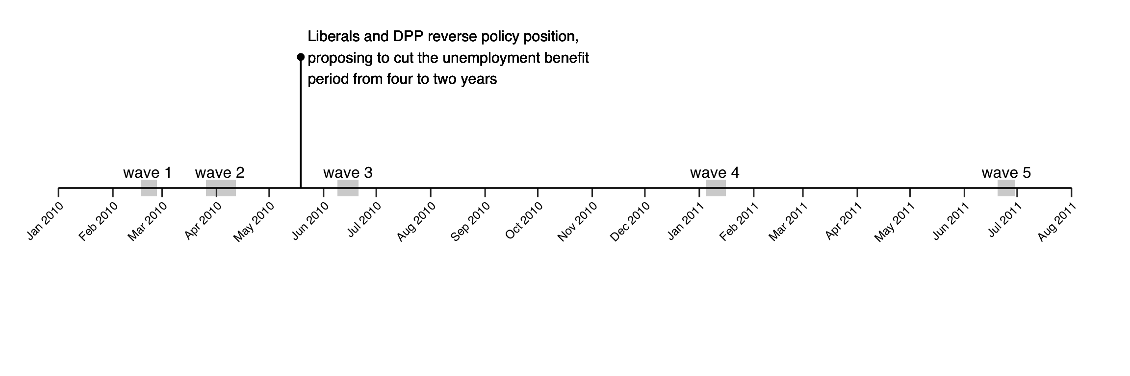
As you can see, two of the survey waves were observed pre-treatment and three post-treatment. Note that not all respondents participated in all rounds – the data you will be working with includes those respondents who participated at least once pre-treatment and at least once post-treatment. This means that there are some missing values in the data, so make sure to specify na.rm=T, for instance, were appropriate (do not remove the missing observations from yfour working data!). The data is called danish and includes the variables listed in the table below. You can load it as follows and the table below lists the included variables:
You will need the following:
# uncomment the two lines below if you don't have the packages installed yet.
# install.packages("Matchit")
library(MatchIt)| Variable | Description |
|---|---|
id |
Each respondent’s unique ID across waves (as factor). |
date |
The start date of the survey wave (as date). |
wave |
The wave number (as factor). Waves 1 & 2 are pre-treatment, waves 3-5 post-treatment. |
ever_treated |
Whether the respondent identifies with one of the parties that switched position (i.e. either the Liberal Party or the Danish People’s Party) = 1, 0 otherwise. |
treated |
Whether the respondent identified with one of the parties that switched position and the survey wave was carried out after the parties switched positions = 1, 0 otherwise. |
cutUnempBenefits |
The dependent variable. Respondent’s position on the statement “The eligibility period for unemployment benefits should be cut from 4 to 2.5 years” ranging from 1 (Completely disagree) to 5 (Completely agree) (continuous). |
benefitW1 & benefitW2 |
A factor version of the respondent’s answer to the dependent variable in waves 1 and 2 (with missings coded as 6). |
male |
If respondent is male = 1, 0 otherwise. |
age |
Age of respondent (in years). |
wrkst |
Occupation of respondent (as factor). |
highered |
Whether respondent attended higher education = 1, 0 otherwise. |
income |
Respondent’s total annual income bracket before taxes (as factor). |
- Subset the data to only include waves 1 and 3 and calculate the mean difference between the outcomes of treatment and control group after treatment has occurred (i.e. in wave 3). Report this difference and discuss whether we can interpret this quantity as the causal effect of changes in party policy positions on their supporter’s opinions. Then, with the same data, calculate the difference-in-differences and explain why this may be a better causal estimate.
danish2 <- danish[danish$wave %in% c(1,3),]

# naive DIGM
post_difference <- mean(danish2$cutUnempBenefits[danish2$ever_treated==1&danish2$wave==3],na.rm = T)-
  mean(danish2$cutUnempBenefits[danish2$ever_treated==0&danish2$wave==3],na.rm = T)
post_difference
## [1] 1.243727# DiD
## parallel trends calculation
pre_post_difference_treat <-
mean(danish2$cutUnempBenefits[danish2$ever_treated==1&danish2$wave==3],na.rm = T)-
mean(danish2$cutUnempBenefits[danish2$ever_treated==1&danish2$wave==1],na.rm = T)
pre_post_difference_control <-
mean(danish2$cutUnempBenefits[danish2$ever_treated==0&danish2$wave==3],na.rm = T)-
mean(danish2$cutUnempBenefits[danish2$ever_treated==0&danish2$wave==1],na.rm = T)
pre_post_difference_treat - pre_post_difference_control## [1] 0.4270236The naive difference in group means (1.24) is likely biased as the treatment and control groups are likely different in their potential outcomes. These means that we cannot rule out selection bias, meaning that the difference in groups means is not an unbiased estimate of the average treatment effect.
If we assume that selection bias is stable over time or, equivalently, we assume that the treatment and control groups would follow the same trends if the treatment group was not treated, we can use the pre-treatment difference to ‘remove’ the selection bias from the difference in group means. Provided that the parallel trends assumption holds, the difference in difference is an unbiased estimate of the average treatment effect on the treated and is equal to 0.43.
- Now, with the full data and all waves, use (a) linear regression with an appropriate interaction term and (b) two-way fixed effect regression to estimate the difference-in-difference.
danish$post_treatment <- danish$wave %in% 3:5
m1 <- lm(cutUnempBenefits ~ wave*ever_treated, data = danish)
m2 <- lm(cutUnempBenefits ~ post_treatment*ever_treated, data = danish)
m3 <- lm(cutUnempBenefits ~ wave + treated + id, data= danish)

texreg::screenreg(list(m1,m2,m3), single.row = T,
                  omit.coef = "id",
                  custom.coef.names = c("Intercept", paste("Wave",2:5),
                                        "Treatment group",
                                        paste("Treatment group x Wave",2:5),
                                        "Post-treatment period",
                                        "Post-treatment period x Treatment group",
                                        "Treatment"))
##
## ===================================================================================================
## Model 1 Model 2 Model 3
## ---------------------------------------------------------------------------------------------------
## Intercept 2.31 (0.04) *** 2.36 (0.03) *** 0.89 (0.36) *
## Wave 2 0.10 (0.05) 0.09 (0.03) ***
## Wave 3 0.19 (0.06) *** 0.23 (0.03) ***
## Wave 4 0.17 (0.06) ** 0.16 (0.03) ***
## Wave 5 0.09 (0.06) 0.08 (0.03) **
## Treatment group 0.82 (0.08) *** 0.82 (0.05) ***
## Treatment group x Wave 2 0.00 (0.11)
## Treatment group x Wave 3 0.43 (0.11) ***
## Treatment group x Wave 4 0.33 (0.11) **
## Treatment group x Wave 5 0.36 (0.12) **
## Post-treatment period 0.11 (0.04) **
## Post-treatment period x Treatment group 0.37 (0.07) ***
## Treatment 0.36 (0.04) ***
## ---------------------------------------------------------------------------------------------------
## R^2 0.09 0.09 0.79
## Adj. R^2 0.09 0.09 0.72
## Num. obs. 8878 8878 8878
## ===================================================================================================
## *** p < 0.001; ** p < 0.01; * p < 0.05In model 1, we essentially calculate the ATT at each wave (the lags and leads!). The coefficient for ever_treated captures the difference between treatment and control groups in wave 1. The coefficient for the interaction with wave2 shows that this difference stays the same before treatment. However, after treatment, the average difference in support for the policy increases and this increase is statistically significant. The coefficient for the interaction between wave3 and ever_treated (the ATT for wave 3) is equal to the one calculated via DiD. The difference is slightly smaller in waves 4 and 5.
In models 2 and 3, the treatment indicator represents the average treatment effect on the treated in all post-treatment periods compared to all pre-treatment periods. The estimate is 0.36 (about the average of the coefficients for waves 3, 4 and 5 in model 1).
- Explain what the identification assumption needed in a difference-in-difference design is, and what it means in the context of this study. Then provide a visual assessment of the plausibility of that assumption and discuss what you see.
library(sjPlot)
library(tidyverse)
library(ggthemes)

moddata <- get_model_data(m1, type="int") |> rename(time = x, treated = group)

ggplot(moddata, aes(x=time, y= predicted, color = treated)) +
  geom_point() + geom_line() + ggtitle("Parallel Trends?") +
  geom_errorbar(aes(ymin = conf.low, ymax=conf.high),width=.05) +
  geom_vline(aes(xintercept = 2.5)) + ylim(2,4) + theme_clean() +
  lemon::coord_capped_cart(bottom = "both", left = "both") +
  theme(axis.ticks.length.x = unit(2.5,"mm"),
        plot.background = element_rect(color=NA),
        axis.title = element_blank(),
        panel.grid.major.y = element_blank(),
        legend.position="bottom")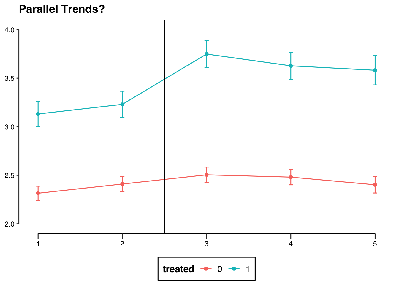
The crucial identifying assumption for a difference in differences design is the parallel trends assumption. It means that we assume that the treatment group would follow the same trend than the control in the absence of treatment. This assumption is untestable because of the FPOCI. However, we can have a look at the trends before treatment to provide some evaluation of the likelihood that the assumption holds. This is shown in the figure above, and the pre-treatment trends look relatively parallel. However, it is worth noting that we only have 2 pre-treatment observations, so there is not a huge amount of evidence for the plausibility of the parallel trends assumption.
One way to improve the plausibility of a difference-in-difference estimator, is to use only those control observations that are the most similar to the treated observations. To achieve this, we can employ matching. Follow the steps outlined below.
- Subset the data to only include those observations from wave 1.
- Use
benefitW1,benefitW2,male,age,wrkst,higheredandincomeas variables to match on (leave the factor variables as factors!) andever_treatedas the treatment variable.- Implement matching without replacement and a 1:1 ratio. You can choose the matching method and distance measure you deem most appropriate. Report the code you used.
- Report the numbers of matched observations in treatment and control group and compare these to the original data-set. Provide a visual illustration of the matching procedure and briefly discuss what you see.
- Finally extract the variable
idfrom the matched data set as shown in the code below.
wave1 <- danish[danish$wave==1,]

# with propensity scores (distance = "glm")
match.out <- matchit(ever_treated ~ male + age + wrkst + highered + income +
                       benefitW1 + benefitW2,
                     data = wave1,
                     method = "nearest",
                     distance = "glm",
                     replace = F,
                     ratio = 1,
                     estimand = "ATT")

summary(match.out)$nn # number of matched observations
## Control Treated
## All (ESS) 1566 512
## All 1566 512
## Matched (ESS) 512 512
## Matched 512 512
## Unmatched 1054 0
## Discarded 0 0## Min. 1st Qu. Median Mean 3rd Qu. Max.
## 0.009379 0.130973 0.212549 0.246391 0.354809 0.703597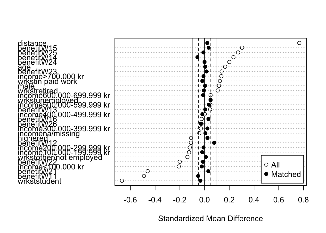
## [1] 0.1834921## [1] 0.0227301In this case, I’ve opted for a distance based on propensity scores (that is, the treatment group is regressed on the covariates with logistic regression to calculate the probability of treatment for each observation). Based on the plot of mean standardised differences, this method seems to have done quite well in reducing the difference between and treatment and control group in terms of observable characteristics.
This is also a good occasion to talk about the common support assumption. Remember the common support assumption states that there has to be some variation in treatment (i.e. some treated and control units) conditional on \(X\), in other words: the probability of treatment for each observation cannot be zero. This is what a propensity score (this method’s distance measure) is, and in this case it ranges from 0.009 to 0.7, meaning that the lowest proportion of treated observations in a cross-section/sub-group of our data based on the (all categorical) variables we included is about 1% and the highest is 70%.
That all being said, it is generally good practice to not just use one matching technique but circle through several and choose the one with the lowest standardised mean bias. To do so, you could adapt the code from seminar 3 and circle through 4 distance measures ("glm", "euclidean", "mahalanobis", "genetic") and ratios of 1 or 2 control per one treatment observations (no need to try with replacement, as we want to select those control observations that are better matches and not re-use some more than once). I’m not going to show this here, but note that the propensity score 1:1 matching chosen above yields the lowest average absolute standardized bias, followed by a but by the much more computationally intensive genetic 1:1 matching. Therefore, we will use the matched observations resulting from that procedure and discarding all the unmatched control units.
- Now, create a subset of the full data to only keep those observations with the ID’s that you got from the matching procedure. Once more, provide a visual assessment of the identifying assumption and compare this matched version to your plot from question 3. Re-run the models from 2. with the subsetted data. Discuss your findings and contrast them to the results from the un-matched data.
# prepare data
danish2 <- danish[danish$id %in% matched.id,] # subset data to keep only matched id's

# models with subsetted data
m1_matched <- lm(cutUnempBenefits ~ wave*ever_treated, data = danish2)
m2_matched <- lm(cutUnempBenefits ~ post_treatment*ever_treated, data = danish2)
m3_matched <- lm(cutUnempBenefits ~ wave + treated + id, data= danish2)

texreg::screenreg(list(m1_matched,m2_matched,m3_matched), single.row = T,
                  omit.coef = "id",
                  custom.coef.names = c("Intercept", paste("Wave",2:5),
                                      "Treatment group",
                                      paste("Treatment group x Wave",2:5),
                                      "Post-treatment period",
                                      "Post-treatment period x Treatment group",
                                      "Treatment"))
##
## ===================================================================================================
## Model 1 Model 2 Model 3
## ---------------------------------------------------------------------------------------------------
## Intercept 3.11 (0.07) *** 3.18 (0.05) *** 3.47 (0.38) ***
## Wave 2 0.15 (0.10) 0.10 (0.04) *
## Wave 3 0.05 (0.10) 0.06 (0.05)
## Wave 4 -0.11 (0.10) -0.12 (0.05) *
## Wave 5 -0.10 (0.10) -0.15 (0.05) **
## Treatment group 0.02 (0.09) -0.01 (0.07)
## Treatment group x Wave 2 -0.05 (0.14)
## Treatment group x Wave 3 0.57 (0.14) ***
## Treatment group x Wave 4 0.60 (0.14) ***
## Treatment group x Wave 5 0.55 (0.15) ***
## Post-treatment period -0.12 (0.06)
## Post-treatment period x Treatment group 0.60 (0.09) ***
## Treatment 0.59 (0.05) ***
## ---------------------------------------------------------------------------------------------------
## R^2 0.03 0.03 0.77
## Adj. R^2 0.03 0.02 0.70
## Num. obs. 4382 4382 4382
## ===================================================================================================
## *** p < 0.001; ** p < 0.01; * p < 0.05moddata <- get_model_data(m1_matched, type="int") |>
rename(time = x, treated = group) |>
mutate(sample = "matched") |>
bind_rows(get_model_data(m1, type="int") |>
rename(time = x, treated = group) |>
mutate(sample = "unmatched") |>
filter(treated == 0 ))
ggplot(moddata, aes(x=time, y= predicted, color = treated, linetype = sample)) +
geom_point() + geom_line() + ggtitle("Parallel Trends?") +
geom_errorbar(aes(ymin = conf.low, ymax=conf.high),width=.05) +
geom_vline(aes(xintercept = 2.5)) + ylim(2,4) + theme_clean() +
lemon::coord_capped_cart(bottom = "both", left = "both") +
theme(axis.ticks.length.x = unit(2.5,"mm"),
plot.background = element_rect(color=NA),
axis.title = element_blank(),
panel.grid.major.y = element_blank(),
legend.position="bottom")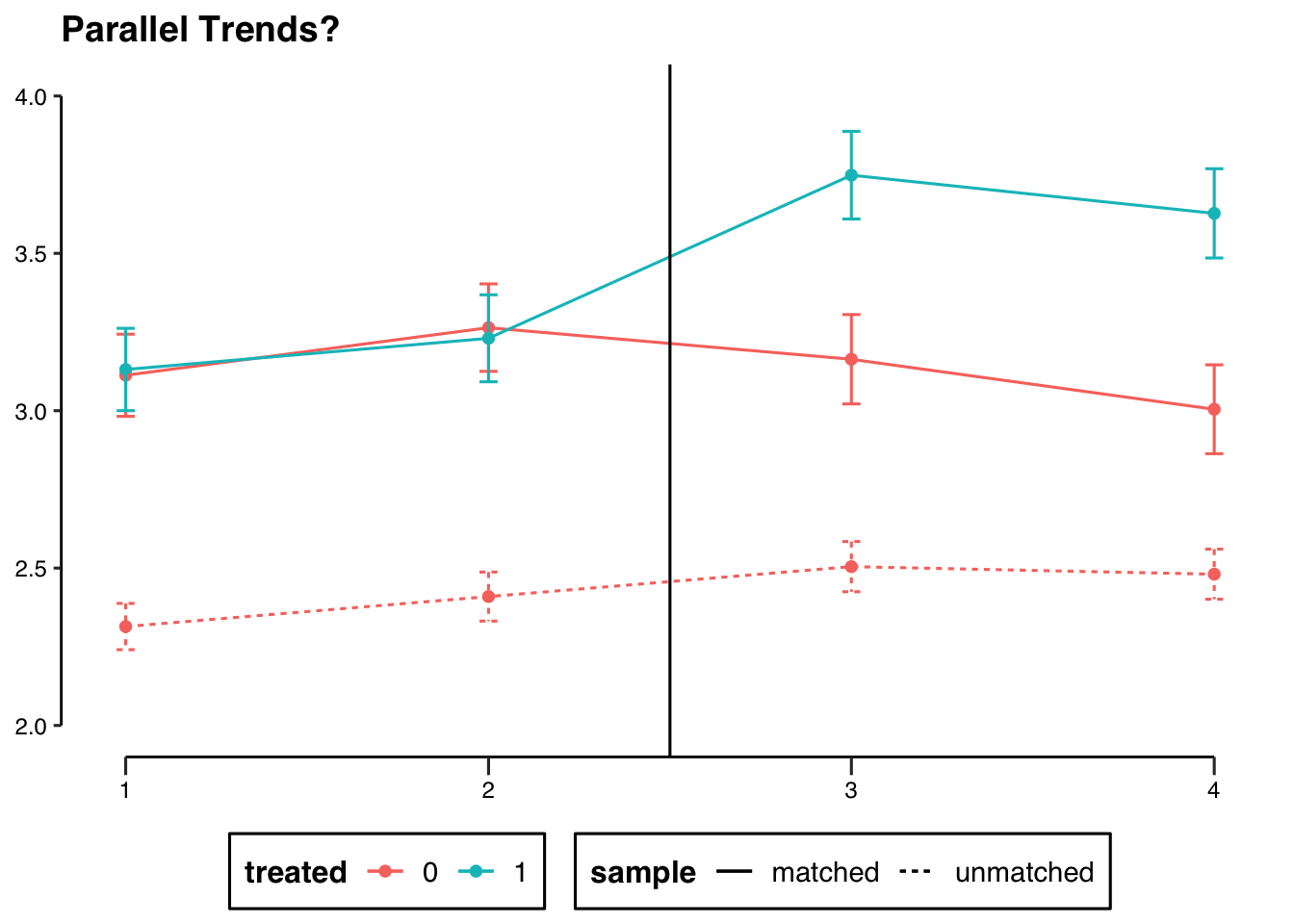
After matching, the trend lines between the treatment and control groups are virtually the same pre-treatment. By using matching as a pre-processing methods, we could control for selection bias from observable confounders by restricting our control group to those observations that are better counterfactuals for the treatment group, strengthening belief in the parallel trends assumption. The estimated ATTs are larger in both models (slightly more than half a point difference on a 1-5 response scale.)
- Thinking about the research question - how powerful are political parties in shaping citizens’ opinions? - what do you conclude from these analyses? Comment on one strength and one weaknesses of the analysis you have conducted.
The shift in position from the partisans following the parties’ shift is both statistically and substantively significant. Moreover, the effect appears to persist over time (about a year later!). So it seems that parties are quite powerful for shaping partisan opinions, but not citizen more broadly. Another question is whether there is something about these policies that was special, in the sense that partisans did not identify very strongly with the policy itself to begin with, so their views were ‘easier’ to move.
The panel data, especially given that it is observed in relatively narrow time intervals in waves 1-3, combined with matching makes the calculated quantities pretty good (yes, very scientific term) estimates of the ATT. A weakness would be the only two pre-treatment observations.
5.3 Quiz
- How many potential outcomes does a unit have in a difference-in-differences framework?
- Two
- One per each time period
- Two per each time period
- Infinite
- What do we use the “parallel trends assumption” for?
- To randomise treatment assignment and timing of treatment assignment
- To substitute the unobservable untreated post-treatment potential outcome of the treatment group with potential outcomes we can observe
- To control for all time-varying characteristics that affect only the treatment group
- To observe the untreated post-treatment potential outcome of the treatment group
- What is the difference-in-differences?
- The difference between post-treatment and pre-treatment levels of Y in the treatment group minus the same quantity for the control group
- The difference between post-treatment and pre-treatment levels of Y for the treatment group
- The difference between post-treatment levels of Y of the treatment and control group minus the same quantity for the pre-treatment
- The difference between levels of Y of the treatment and the control group post-treatment
- Can we test the parallel trends assumption?
- No
- Yes
- Only in an experiment
- Only by including two-way fixed effects
- What do unit- and time-fixed effects hold constant?
- Characteristics that are specific to each unit and to each time-period respectively
- Characteristics that are specific to each unit and their time trends
- Characteristics that vary within-unit over time
- Characteristics that affect only the treatment group over time
“Simultaneity is where the explanatory variable is jointly determined with the dependent variable. In other words, X causes Y but Y also causes X. It is one cause of endogeneity.”↩︎
From 2001 until 2011, Denmark was governed by a minority coalition between the Liberal Party and the Conservative People’s Party (Det Konservative Folkeparti) with parliamentary support from the Danish People’s Party. This means that, while the DPP did not have any ministers in government, it had considerable influence on the government’s policy agenda.↩︎