6 Interactions, Non-Linearities, Fixed Effects
6.1 Seminar
rm(list = ls())
setwd("~/PUBLG100")
We load the required packages for this week:
library(foreign)
library(texreg)
6.1.1 Loading Data
We will use the small version of the Quality of Government data from 2012 again (QoG2012.csv) with four variables:
| Variable | Description |
|---|---|
former_col |
0 = not a former colony 1 = former colony |
undp_hdi |
UNDP Human Development Index. Higher values mean better quality of life |
wbgi_cce |
Control of corruption. Higher values mean better control of corruption |
wdi_gdpc |
GDP per capita in US dollars |
world_data <- read.csv("QoG2012.csv")
names(world_data)
[1] "h_j" "wdi_gdpc" "undp_hdi" "wbgi_cce" "wbgi_pse"
[6] "former_col" "lp_lat_abst"Rename the variables by yourself to:
| New Name | Old Name |
|---|---|
human_development |
undp_hdi |
institutions_quality |
wbgi_cce |
gdp_capita |
wdi_gdpc |
names(world_data)[1] "h_j" "wdi_gdpc" "undp_hdi" "wbgi_cce" "wbgi_pse"
[6] "former_col" "lp_lat_abst"names(world_data)[which(names(world_data)=="undp_hdi")] <- "human_development"
names(world_data)[which(names(world_data)=="wbgi_cce")] <- "institutions_quality"
names(world_data)[which(names(world_data)=="wdi_gdpc")] <- "gdp_capita"
names(world_data)[1] "h_j" "gdp_capita" "human_development"
[4] "institutions_quality" "wbgi_pse" "former_col"
[7] "lp_lat_abst" Now let’s look at the summary statistics for the entire data set.
summary(world_data) h_j gdp_capita human_development institutions_quality
Min. :0.0000 Min. : 226.2 Min. :0.2730 Min. :-1.69953
1st Qu.:0.0000 1st Qu.: 1768.0 1st Qu.:0.5390 1st Qu.:-0.81965
Median :0.0000 Median : 5326.1 Median :0.7510 Median :-0.30476
Mean :0.3787 Mean :10184.1 Mean :0.6982 Mean :-0.05072
3rd Qu.:1.0000 3rd Qu.:12976.5 3rd Qu.:0.8335 3rd Qu.: 0.50649
Max. :1.0000 Max. :63686.7 Max. :0.9560 Max. : 2.44565
NA's :25 NA's :16 NA's :19 NA's :2
wbgi_pse former_col lp_lat_abst
Min. :-2.46746 Min. :0.0000 Min. :0.0000
1st Qu.:-0.72900 1st Qu.:0.0000 1st Qu.:0.1343
Median : 0.02772 Median :1.0000 Median :0.2444
Mean :-0.03957 Mean :0.6289 Mean :0.2829
3rd Qu.: 0.79847 3rd Qu.:1.0000 3rd Qu.:0.4444
Max. : 1.67561 Max. :1.0000 Max. :0.7222
NA's :7 We need to remove missing values from gdp_capita, human_development, and institutions_quality. Do so yourself. Do not drop observations that missing values on other observations such as lp_lat_abst. We might throw away useful information when doing so.
world_data <- world_data[ !is.na(world_data$gdp_capita), ]
world_data <- world_data[ !is.na(world_data$human_development), ]
world_data <- world_data[ !is.na(world_data$institutions_quality), ]
former_col is a categorical variable, let’s see how many observations are in each category:
table(world_data$former_col)
  0   1
 61 111
Turn this variable into a factor variable and check the result with a frequency table.
world_data$former_col <- factor(world_data$former_col, labels = c("never colonies", "ex colonies"))
table(world_data$former_col)
never colonies    ex colonies
            61            111
Now let’s create a scatterplot between institutions_quality and human_development and color the points based on the value of former_col.
NOTE: We’re using pch = 16 to plot solid cicles. You can see other available styles by typing ?points or help(points) at the console.
Copy the plot command in the seminar, you can go over it at home.
# main plot
plot(
  human_development ~ institutions_quality,
  data = world_data,
  frame.plot = FALSE,
  col = former_col,
  pch = 16,
  cex = 1.2,
  bty = "n",
  main = "Relation between institutional quality and hdi by colonial past",
  xlab = "quality of institutions",
  ylab = "human development index"
  )

# add a legend
legend(
  "bottomright",  # position fo legend
  legend = levels(world_data$former_col), # what to seperate by
  col = world_data$former_col, # colors of legend labels
  pch = 16, # dot type
  bty = "n" # no box around the legend
  )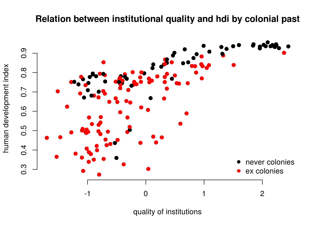
To explain the level of development with quality of institutions is intuitive. We could add the colonial past dummy, to control for potential confounders. Including a dummy gives us the difference between former colonies and not former colonies. It therefore shifts the regression line parallelly. We have looked at binary variables in week 5. To see the effect of a dummy again, refer to the extra info at the bottom of page.
6.1.2 Interactions: Continuous and Binary
From the plot above, we can tell that the slope of the line (the effect of institutional quality) is probably different in countries that were colonies and those that were not. We say: the effect of institutional quality is conditional on colonial past.
To specify an interaction term, we use the asterisk (*)
| Example | |
|---|---|
* |
A*B - In addition to the interaction term (A*B), both the constituents (A and B) are automatically included. |
model1 <- lm(human_development ~ institutions_quality * former_col, data = world_data)
screenreg( model1 )
======================================================
                                            Model 1
------------------------------------------------------
(Intercept)                                   0.79 ***
                                             (0.02)
institutions_quality                          0.08 ***
                                             (0.01)
former_colex colonies                        -0.12 ***
                                             (0.02)
institutions_quality:former_colex colonies    0.05 **
                                             (0.02)
------------------------------------------------------
R^2                                           0.56
Adj. R^2                                      0.55
Num. obs.                                   172
RMSE                                          0.12
======================================================
*** p < 0.001, ** p < 0.01, * p < 0.05
We set our covariate former_col to countries that weren’t colonized and then second, to ex colonies. We vary the quality of institutions from -1.7 to 2.5 which is roughly the minimum to the maximum of the variable.
NOTE: We know the range of values for institutions_quality from the summary statistics we obtained after loading the dataset at the begining of the seminar. You can also use the range() function.
# minimum and maximum of the quality of institutions
range(world_data$institutions_quality)
[1] -1.699529 2.445654We now illustrate what the interaction effect does. To anticipate, the effect of the quality of institutions is now conditional on colonial past. That means, the two regression lines will have different slopes.
We make use of the predict() function to draw both regression lines into our plot. First, we need to vary the institutional quality variable from its minimum to its maximum. We use the seq() (sequence) function to create 10 different institutional quality values. Second, we create two separate covariate datasets. In the first, x1, we set the former_col variable to never colonies. In the second, x2, we set the same variable to ex colonies. We then predict the fitted values y_hat1, not colonised countries, and y_hat2, ex colonies.
# sequence of 10 institutional quality values
institutions_seq <- seq(from = -1.7, to = 2.5, length.out = 10)

# covariates for not colonies
x1 <- data.frame(former_col = "never colonies", institutions_quality = institutions_seq)
# look at our covariates
head(x1)
former_col institutions_quality
1 never colonies -1.7000000
2 never colonies -1.2333333
3 never colonies -0.7666667
4 never colonies -0.3000000
5 never colonies 0.1666667
6 never colonies 0.6333333# covariates for colonies
x2 <- data.frame(former_col = "ex colonies", institutions_quality = institutions_seq)
# look at our covariates
head(x2) former_col institutions_quality
1 ex colonies -1.7000000
2 ex colonies -1.2333333
3 ex colonies -0.7666667
4 ex colonies -0.3000000
5 ex colonies 0.1666667
6 ex colonies 0.6333333# predict fitted values for countries that weren't colonised
yhat1 <- predict(model1, newdata = x1)
# predict fitted values for countries that were colonised
yhat2 <- predict(model1, newdata = x2)We now have the predicted outcomes for varying institutional quality. Once for the countries that were former colonies and once for the countries that were not.
We will re-draw our earlier plot. In addition, right below the plot() function, we use the lines() function to add the two regression lines. The function needs to arguments x and y which represent the coordinates on the respective axes. On the x axis we vary our independent variable quality of institutions. On the y axis, we vary the predicted outcomes.
We add two more arguments to our lines() function. The line width is controlled with lwd and we set the colour is controlled with col which we set to the first and second colours in the colour palette respectively.
# main plot
plot(
  human_development ~ institutions_quality,
  data = world_data,
  frame.plot = FALSE,
  col = former_col ,
  pch = 16,
  cex = 1.2,
  bty = "n",
  main = "Relation between institutional quality and hdi by colonial past",
  xlab = "quality of institutions",
  ylab = "human development index"
  )

# add the regression line for the countries that weren't colonised
lines(x = institutions_seq, y = yhat1, lwd = 2, col = 1)

# add the regression line for the ex colony countries
lines(x = institutions_seq, y = yhat2, lwd = 2, col = 2)

# add a legend
legend(
  "bottomright",  # position fo legend
  legend = levels(world_data$former_col), # what to seperate by
  col = world_data$former_col, # colors of legend labels
  pch = 16, # dot type
  lwd = 2, # line width in legend
  bty = "n" # no box around the legend
  )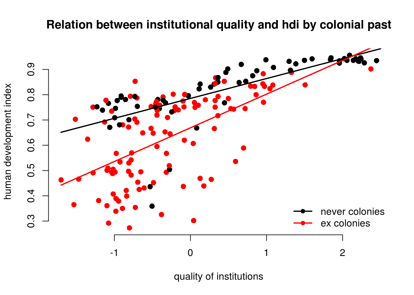
As you can see, the line is steeper for ex colonies than for countries that were never colonised. That means the effect of institutional quality on human development is conditional on colonial past. Institutional quality matters more in ex colonies.
Let’s examine the effect sizes of institutional quality conditional on colonial past.
\[\begin{align} \hat{y} & = & \beta_{0} + \beta_{1} * \mathrm{institutions} + \beta_{2} * \mathrm{former\_col} + \beta_{3} * \mathrm{insitutionsXformer\_col} \\ \hat{y} & = & 0.79 + 0.08 * \mathrm{institutions} + -0.12 * \mathrm{former\_col} + 0.05 * \mathrm{insitutionsXformer\_col} \end{align}\]There are now two scenarios. First, we look at never coloines or second, we look at ex colonies. Let’s look at never colonies first.
If a country was never a colony, R translates the value of the factor variable former_col from never colony to \(0\). From the equation above, it follows that all terms that are multiplied with former_col drop out.
Therefore, the effect of the quality of institutions in never colonies is just the coefficient of institutions_quality \(\beta_1 = 0.08\).
In the second scenario, we are looking at ex colonies. R translates the value of the factor variable former_col from ex colonies to \(1\). In this case none of the terms drop out. From our original equation:
The effect of the quality of institutions is then: \(\beta_1 + \beta_3 = 0.08 + 0.05 = 0.13\).
The numbers also tell us that the effect of the quality of institutions is bigger in ex colonies. For never colonies the effect is \(0.08\) for every unit-increase in institutional quality. For ex colonies, the corresponding effect is \(0.13\).
The table below summarises the interaction of a continuous variable with a binary variable in the context of our regression model.
| Ex Colony | Intercept | Slope |
|---|---|---|
| 0 = never colony | \(\beta_0\) \(= 0.79\) |
\(\beta_1\) \(= 0.08\) |
| 1 = ex colony | \(\beta_0 + \beta_2\) = \(0.79 + -0.12 = 0.67\) |
\(\beta_1 + \beta_3\) \(= 0.08 + 0.05 = 0.13\) |
6.1.3 Non-Linearities
We can use interactions to model non-linearities. Let’s suppose we want to illustrate the relationship between GDP per capita and the human development index.
We draw a scatter plot to investigate the relationship between the quality of life (hdi) and wealth (gdp/captia).
plot(
  human_development ~ gdp_capita,
  data = world_data,
  pch = 16,
  frame.plot = FALSE,
  col = "grey",
  main = "Relationship between the quality of life and wealth",
  ylab = "Human development index",
  xlab = "GDP per capita"
  )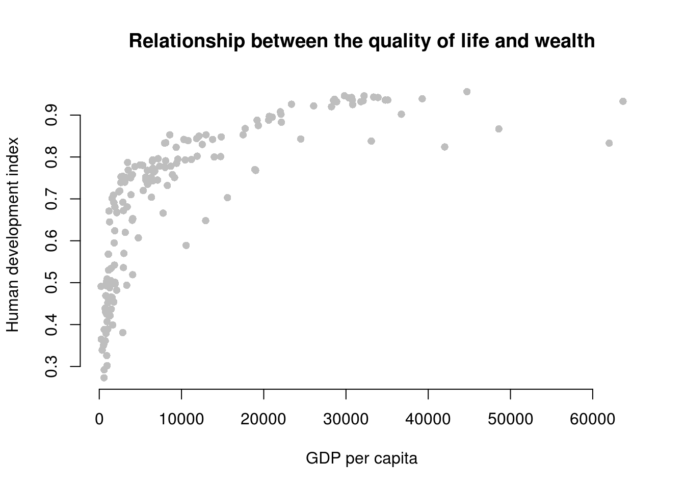
It’s easy to see, that the relationship between GDP per captia and the Human Development Index is not linear. Increases in wealth rapidly increase the quality of life in poor societies. The richer the country, the less pronounced the effect of additional wealth. We would mis-specify our model if we do not take the non-linear relationship into account.
Let’s go ahead and mis-specify our model :-)
# a mis-specified model
bad.model <- lm(human_development ~ gdp_capita, data = world_data)
screenreg( bad.model )
=======================
             Model 1
-----------------------
(Intercept)    0.59 ***
              (0.01)
gdp_capita     0.00 ***
              (0.00)
-----------------------
R^2            0.49
Adj. R^2       0.49
Num. obs.    172
RMSE           0.13
=======================
*** p < 0.001, ** p < 0.01, * p < 0.05
We detect a significant linear relationship. The effect may look small because the coefficient rounded to two digits is zero. But remember, this is the effect of increasing GDP/capita by \(1\) US dollar on the quality of life. That effect is naturally small but it is probably not small when we increase wealth by \(1000\) US dollars.
However, our model would also entail that for every increase in GDP/capita, the quality of life increases on average by the same amount. We saw from our plot that this is not the case. The effect of GDP/capita on the quality of life is conditional on the level of GDP/capita. If that sounds like an interaction to you, then that is great because, we will model the non-linearity by raising the GDP/capita to a higher power. That is in effect an interaction of the variable with itself. GDP/capita raised to the second power, e.g. is GDP/capita * GDP/capita.
6.1.3.1 Polynomials
We know from school that polynomials like \(x^2\), \(x^3\) and so on are not linear. In fact, \(x^2\) can make one bend, \(x^3\) can make two bends and so on.
Our plot looks like the relationship is quadratic. So, we use the poly() function in our linear model to raise GDP/capita to the second power like so: poly(gdp_capita, 2).
better.model <- lm(human_development ~ poly(gdp_capita, 2), data = world_data)
screenreg( list(bad.model, better.model),
           custom.model.names = c("bad model", "better model"))
==============================================
                      bad model   better model
----------------------------------------------
(Intercept)             0.59 ***    0.70 ***
                       (0.01)      (0.01)
gdp_capita              0.00 ***
                       (0.00)
poly(gdp_capita, 2)1                1.66 ***
                                   (0.10)
poly(gdp_capita, 2)2               -1.00 ***
                                   (0.10)
----------------------------------------------
R^2                     0.49        0.67
Adj. R^2                0.49        0.66
Num. obs.             172         172
RMSE                    0.13        0.10
==============================================
*** p < 0.001, ** p < 0.01, * p < 0.05
It is important to note, that in the better model the effect of GDP/capita is no longer easy to interpret. We cannot say for every increase in GDP/capita by one dollar, the quality of life increases on average by this much. No, the effect of GDP/capita depends on how rich a country was to begin with.
It looks like our model that includes the quadratic term has a much better fit. The adjusted R^2 increases by a lot. Furthermore, the quadratic term, poly(gdp_capita, 2)2 is significant. That indicates that newly added variable improves model fit. We can run an F-test with anova() function which will return the same result. The F-test would be useful when we add more than one new variable, e.g. we could have raised GDP_captia to the power of 5 which would have added four new variables.
# f test
anova(bad.model, better.model)
Analysis of Variance Table
Model 1: human_development ~ gdp_capita
Model 2: human_development ~ poly(gdp_capita, 2)
Res.Df RSS Df Sum of Sq F Pr(>F)
1 170 2.8649
2 169 1.8600 1 1.0049 91.31 < 2.2e-16 ***
---
Signif. codes: 0 '***' 0.001 '**' 0.01 '*' 0.05 '.' 0.1 ' ' 1We can interpret the effect of wealth (GDP/capita) on the quality of life (human development index) by predicting the fitted values of the human development index given a certain level of GDP/capita. We will vary GDP/captia from its minimum in the data to its maximum and the plot the results which is a good way to illustrate a non-linear relationship.
Step 1: We find the minimum and maximum values of GDP/capita.
# find minimum and maximum of per capita gdp
range(world_data$gdp_capita)
[1] 226.235 63686.676Step 2: We predict fitted values for varying levels of GDP/captia (let’s create 100 predictions).
# our sequence of 100 GDP/capita values
gdp_seq <- seq(from = 226, to = 63686, length.out = 100)

# we set our covarite values (here we only have one covariate: GDP/captia)
x <- data.frame(gdp_capita = gdp_seq)

# we predict the outcome (human development index) for each of the 100 GDP levels
y_hat <- predict(better.model, newdata = x)
Step 3: Now that we have created our predictions. We plot again and then we add the bad.model using abline and we add our non-linear version better.model using the lines() function.
plot(
  human_development ~ gdp_capita,
  data = world_data,
  pch = 16,
  frame.plot = FALSE,
  col = "grey",
  main = "Relationship between the quality of life and wealth",
  ylab = "Human development index",
  xlab = "GDP per capita"
  )

# the bad model
abline(bad.model, col = 1, lwd = 2)

# better model
lines(x = gdp_seq, y = y_hat, col = 2, lwd = 2)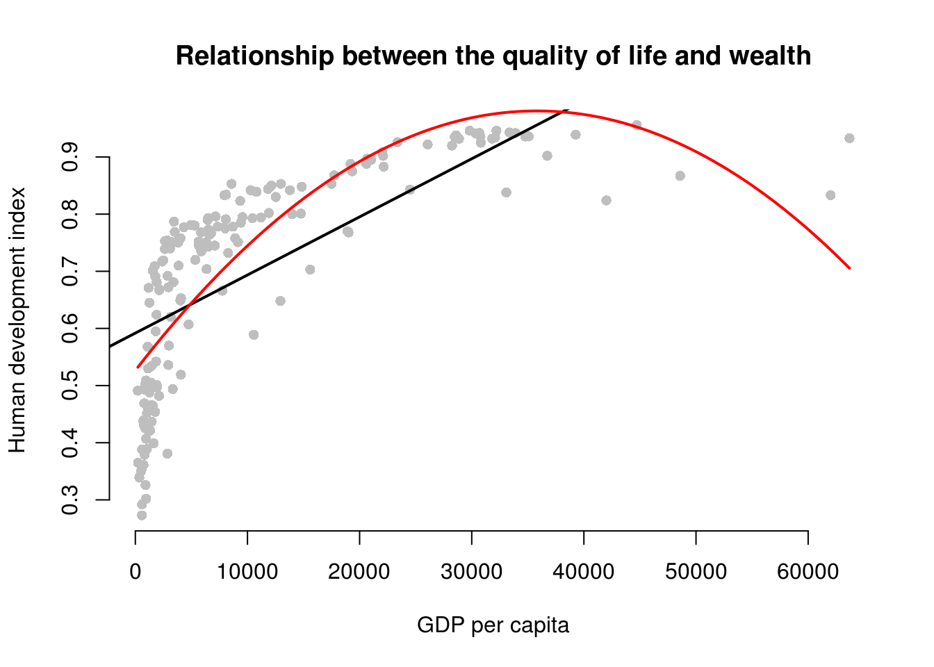
At home, we want you to estimate even.better.model with GDP/capita raised to the power of three to determine whether the data fit improves. Show this visually and with an F test.
# estimate even better model with gdp/capita^3
even.better.model <- lm(human_development ~ poly(gdp_capita, 3), data = world_data)

# f test
anova(better.model, even.better.model)
Analysis of Variance Table
Model 1: human_development ~ poly(gdp_capita, 2)
Model 2: human_development ~ poly(gdp_capita, 3)
Res.Df RSS Df Sum of Sq F Pr(>F)
1 169 1.8600
2 168 1.4414 1 0.41852 48.779 6.378e-11 ***
---
Signif. codes: 0 '***' 0.001 '**' 0.01 '*' 0.05 '.' 0.1 ' ' 1# so, our even better.model is statistically significantly even better
# we predict the outcome (human development index) for each of the 100 GDP levels
y_hat2 <- predict(even.better.model, newdata = x)
plot(
human_development ~ gdp_capita,
data = world_data,
pch = 16,
frame.plot = FALSE,
col = "grey",
main = "Relationship between the quality of life and wealth",
ylab = "Human development index",
xlab = "GDP per capita"
)
# the bad model
abline(bad.model, col = 1, lwd = 2)
# better model
lines(x = gdp_seq, y = y_hat, col = 2, lwd = 2)
# even better model
lines(x = gdp_seq, y = y_hat2, col = 3, lwd = 2)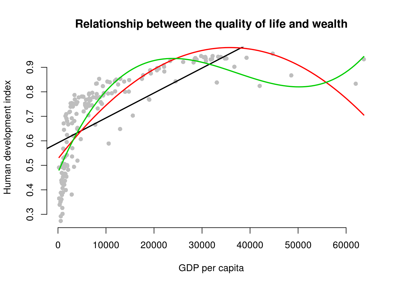
We generate an even better fit with the cubic, however it still looks somewhat strange. The cubic is being wagged around by its tail. The few extreme values cause the strange shape. This is a common problem with polynomials. We move on to an alternative.
6.1.3.2 Log-transformations
Many non-linear relationships actually do look linear on the log scale. We can illustrate this by taking the natural logarithm of GDP/captia and plot the relationship between quality of life and our transformed GDP variable.
Note: Some of you will remember from your school calculators that you have an ln button and a log button where ln takes the natural logarithm and log takes the logarithm with base 10. The natural logarithm represents relations that occur frequently in the world and R takes the natural logarithm with the log() function by default.
Below, we plot the same plot from before but we wrap gdp_capita in the log() function which log-transforms the variable.
plot(
  human_development ~ log(gdp_capita),
  data = world_data,
  pch = 16,
  frame.plot = FALSE,
  col = "grey",
  main = "Relationship between the quality of life and wealth on the log scale",
  ylab = "Human development index",
  xlab = "Logged gdp/capita"
  )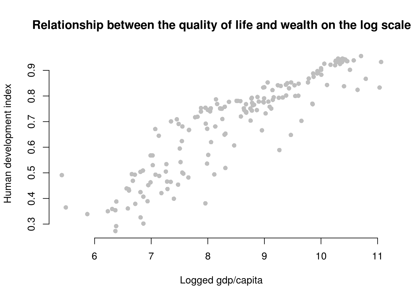
As you can see, the relationship now looks linear and we get the best fit to the data if we run our model with log-transformed gdp.
# run model with log-transformed gdp
best.model <- lm(human_development ~ log(gdp_capita), data = world_data)

# let's check our model
screenreg( list(bad.model, better.model, even.better.model, best.model),
           custom.model.names = c("Bad Model", "Better Model", "Even Better Model", "Best Model"))
=============================================================================
                      Bad Model   Better Model  Even Better Model  Best Model
-----------------------------------------------------------------------------
(Intercept)             0.59 ***    0.70 ***      0.70 ***          -0.36 ***
                       (0.01)      (0.01)        (0.01)             (0.04)
gdp_capita              0.00 ***
                       (0.00)
poly(gdp_capita, 2)1                1.66 ***
                                   (0.10)
poly(gdp_capita, 2)2               -1.00 ***
                                   (0.10)
poly(gdp_capita, 3)1                              1.66 ***
                                                 (0.09)
poly(gdp_capita, 3)2                             -1.00 ***
                                                 (0.09)
poly(gdp_capita, 3)3                              0.65 ***
                                                 (0.09)
log(gdp_capita)                                                      0.12 ***
                                                                    (0.00)
-----------------------------------------------------------------------------
R^2                     0.49        0.67          0.74               0.81
Adj. R^2                0.49        0.66          0.74               0.81
Num. obs.             172         172           172                172
RMSE                    0.13        0.10          0.09               0.08
=============================================================================
*** p < 0.001, ** p < 0.01, * p < 0.05
Polynomials can be useful for modelling non-linearities. However, for each power we add an additional parameter that needs to be estimated. This reduces the degrees of freedom. If we can get a linear relationship on the log scale, one advantage is that we lose only one degree of freedom. Furthermore, we gain interpretability. The relationship is linear on the log scale of gdp/capita. This means we can interpret the effect of gdp/captia as: For an increase of gdp/captia by one percent, the quality of life increases by \(\frac{0.12}{100}\) points on average. The effect is very large because human_development only varies from \(0\) to \(1\).
To assess model fit, the f test is not very helpful here because, the initial model and the log-transformed model estimate the same number of parameters (the difference in the degrees of freedom is 0). Therefore, we rely on adjusted R^2 for interpretation of model fit. It penalises for additional parameters. According to our adjusted R^2, the log-transformed model provides the best model fit.
To illustrate that this is the case, we return to our plot and show the model fit graphically.
# fitted values for the log model (best model)
y_hat3 <- predict(best.model, newdata = x)

# plot showing the fits
plot(
  human_development ~ gdp_capita,
  data = world_data,
  pch = 16,
  frame.plot = FALSE,
  col = "grey",
  main = "Relationship between the quality of life and wealth",
  ylab = "Human development index",
  xlab = "GDP per capita"
  )

# the bad model
abline(bad.model, col = 1, lwd = 2)

# better model
lines(x = gdp_seq, y = y_hat, col = 2, lwd = 2)

# even better model
lines(x = gdp_seq, y = y_hat2, col = 3, lwd = 2)

# best model
lines(x = gdp_seq, y = y_hat3, col = 4, lwd = 2)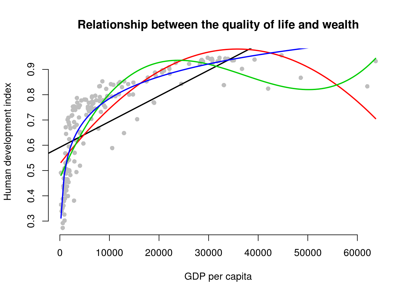
The dark purple line shows the log-transformed model. It clearly fits the data best.
6.1.4 Fixed Effects
More guns less crime. This was the claim of an (in)famous book.
It shows that violent crime rates in the United States decrease when gun ownership restrictions are relaxed. The data used in Lott’s research compares violent crimes, robberies, and murders across 50 states to determine whether the so called “shall” laws that remove discretion from license granting authorities actually decrease crime rates. So far 41 states have passed these “shall” laws where a person applying for a licence to carry a concealed weapon doesn’t have to provide justification or “good cause” for requiring a concealed weapon permit.
We clear or cluttered workspace and load the dataset.
rm(list = ls())
guns <- read.csv("guns.csv")
The variables we’re interested in are described below.
| Variable | Definition |
|---|---|
| mur | Murder rate (incidents per 100,000) |
| shall | = 1 if the state has a shall-carry law in effect in that year = 0 otherwise |
| incarc_rate | Incarceration rate in the state in the previous year (sentenced prisoners per 100,000 residents; value for the previous year) |
| pm1029 | Percent of state population that is male, ages 10 to 29 |
| stateid | ID number of states (Alabama = 1, Alaska = 2, etc.) |
| year | Year (1977-1999) |
Let’s look at a panel dataset structure. An observation here is a state in the US in particular year. So, the first row is the US state 1 in 1977. Row 2 is state 1 in 1978 and so on.
head(guns) year vio mur rob incarc_rate pb1064 pw1064 pm1029 pop
1 77 414.4 14.2 96.8 83 8.384873 55.12291 18.17441 3.780403
2 78 419.1 13.3 99.1 94 8.352101 55.14367 17.99408 3.831838
3 79 413.3 13.2 109.5 144 8.329575 55.13586 17.83934 3.866248
4 80 448.5 13.2 132.1 141 8.408386 54.91259 17.73420 3.900368
5 81 470.5 11.9 126.5 149 8.483435 54.92513 17.67372 3.918531
6 82 447.7 10.6 112.0 183 8.514000 54.89621 17.51052 3.925229
avginc density stateid shall
1 9.563148 0.07455240 1 0
2 9.932000 0.07556673 1 0
3 9.877028 0.07624532 1 0
4 9.541428 0.07682881 1 0
5 9.548351 0.07718658 1 0
6 9.478919 0.07731851 1 0We will focus on murder rates in this example but you could try the same with variables measuring violent crimes or robberies as well.
First we estimate a simple linear model like we have done previously.
# a linear model that does not take time or state effects into account
simple <- lm(mur ~ shall + incarc_rate + pm1029, data = guns)
screenreg(simple)
========================
             Model 1
------------------------
(Intercept)   -26.68 ***
               (1.53)
shall          -1.96 ***
               (0.32)
incarc_rate     0.04 ***
               (0.00)
pm1029          1.64 ***
               (0.09)
------------------------
R^2             0.65
Adj. R^2        0.65
Num. obs.    1173
RMSE            4.44
========================
*** p < 0.001, ** p < 0.01, * p < 0.05
Well, the coefficient of laxer gun laws shall is significant and negative. That means the claim is supported by our model. More guns less crimes. However, there are fifty states plus D.C. in our data. There is a lot of potential for confounding here. The relationship between shall laws and crime rates we observe may be driven by differences between the states that also correlate with crime rates and gun laws. For instance, we would expect that urban areas are more plagued by violent crimes than rural areas Urban areas tend to also be more liberal and not pass shall laws.
In order to control for potential confounding, we will therefore estimate a state fixed effects model. We control for all states in the model. By including fixed effects in that way we control for everything that is different across the states but stays constant over time.
Let’s estimate a fixed effect model with shall, incarc_rate, and pm1029 as the independent variables. Our first model introduces state fixed effects by using the factor() function around stateid.
Note: By setting the custom.coef.map in the screenreg() function, we only show the coefficients that we are interested in. We do not really care about the state dummies and our table would become huge if we displayed them. Play around with this at home. Take out the custom.coef.map argument and look at the entire regression table.
state_effects <- lm(mur ~ shall + incarc_rate + pm1029 + factor(stateid),  data = guns)

# regression table (hiding intercept and fixed effects)
screenreg(list(simple, state_effects),
          custom.model.names = c("Simple Model", "State Fixed Effects"), # model name
          custom.coef.map = list(shall = "Shall", # list of variables we want displayed
                                 incarc_rate = "Icarceration Rate",
                                 pm1029 = "Percent Young Male"))
=====================================================
                    Simple Model  State Fixed Effects
-----------------------------------------------------
Shall                 -1.96 ***     -1.45 ***
                      (0.32)        (0.32)
Icarceration Rate      0.04 ***      0.02 ***
                      (0.00)        (0.00)
Percent Young Male     1.64 ***      0.96 ***
                      (0.09)        (0.09)
-----------------------------------------------------
R^2                    0.65          0.85
Adj. R^2               0.65          0.85
Num. obs.           1173          1173
RMSE                   4.44          2.96
=====================================================
*** p < 0.001, ** p < 0.01, * p < 0.05
The state fixed effects model still confirms that lax guns laws reduce the murder rate. Adjusted R^2 indicates that controlling for differences between states explains murder the rate better than not doing so. Furthermore, the magnitude of the effect of shall laws decreases. That means that the effect, we estimated in the simple model was biased or put differently it was confounded. We attributed more of the reduction in crimes to the shall laws than we should have, because some of it is really explained by other factors that vary across states and correlate with crime rates and shall laws.
As we discussed in the lecture, state fixed effects control for all the differences between states which do not change over time. Let’s look at the time period our data covers. We use the function unique() which returns the unique values the year variable takes (you could also look at the codebook).
unique(guns$year) [1] 77 78 79 80 81 82 83 84 85 86 87 88 89 90 91 92 93 94 95 96 97 98 99Our data covers the period from 1977 to 1999. It is reasonable to assume that a lot has changed during that time. Specifically, crime rates went up in the 70s and 80s in the inner cities by huge amounts, due to poverty, discrimination, and drugs like heroin. The crime rate decreased in the 90s. Incidentally, shall laws were introduced more in more recent times. You can see where we are heading. There are probably confounding factors that vary over time but are constant across states. Times have changed…
To analyse the data properly, we therefore, need to hold constant everything that changed over time but varied across states using time fixed effects (we keep the state fixed effects and therefore capture differences across states that are constant over time). We can do so by using the factor() function on year just like we did with state fixed effects earlier.
# state and time fixed effects model
state_and_time_effects <- lm(mur ~ shall + incarc_rate + pm1029 + factor(stateid) + factor(year),  data = guns)

# regression table
screenreg(list(simple, state_effects, state_and_time_effects),
          custom.model.names = c("Simple Model", "State Fixed Effects", "State and Time Fixed Effects"), # model name
          custom.coef.map = list(shall = "Shall", # list of variables we want displayed
                                 incarc_rate = "Icarceration Rate",
                                 pm1029 = "Percent Young Male"))
===================================================================================
                    Simple Model  State Fixed Effects  State and Time Fixed Effects
-----------------------------------------------------------------------------------
Shall                 -1.96 ***     -1.45 ***            -0.56
                      (0.32)        (0.32)               (0.33)
Icarceration Rate      0.04 ***      0.02 ***             0.02 ***
                      (0.00)        (0.00)               (0.00)
Percent Young Male     1.64 ***      0.96 ***             0.73 ***
                      (0.09)        (0.09)               (0.22)
-----------------------------------------------------------------------------------
R^2                    0.65          0.85                 0.87
Adj. R^2               0.65          0.85                 0.86
Num. obs.           1173          1173                 1173
RMSE                   4.44          2.96                 2.79
===================================================================================
*** p < 0.001, ** p < 0.01, * p < 0.05
Well well well! Not only, did the magnitude of the shall variable decrease substantially by a factor of almost three. In addition, the effect is no longer distinguishable from zero. It seems that lax guns laws do not explain reduced crime rates afterall. Whereas the incarceration rate and the percentage of young males do. Adjusted R^2 increased again, indicating that the state and time fixed effects model explains the variance in the murder rate best.
Note: The increase in adjusted R^2 is small. This, however, is not surprising as we already explain the outcome very well. It becomes increasingly harder to explain the outcome, the better the model is. To assess, whether state or time fixed effects explain more variance, one could compare the simple model to a model that includes state fixed effects only and then to a model that includes time fixed effects only. You should try that at home.
6.1.5 Exercises
- Using
better model, where we included the square of GDP/capita, what is the effect of:- an increase of GDP/capita from 5000 to 15000?
- an increase of GDP/capita from 25000 to 35000?
- You can see that the curve in our quadratic plot curves down when countries become very rich. Speculate whether that results make sense and what the reason for this might be.
- Raise GDP/captia to the highest power using the
poly()that significantly improves model fit.- Does your new model solve the potentially artefical down-curve for rich countries?
- Does the new model improve upon the old model?
- Plot the new model.
- Estimate a model where
wbgi_pse(political stability) is the response variable andh_jandformer_colare the explanatory variables. Include an interaction between your explanatory variables. What is the marginal effect of:- An independent judiciary when the country is a former colony?
- An independent judiciary when the country was not colonized?
- Does the interaction between
h_jandformer_colimprove model fit?
- Run a model on the human development index (
hdi), interacting an independent judiciary (h_j) andinstitutions_quality. What is the effect of quality of institutions:- In countries without an independent judiciary?
- When there is an independent judiciary?
- Illustrate your results.
- Does the interaction improve model fit?
- Clear your workspace and download the California Test Score Data used by Stock and Watson.
- Download ‘caschool.dta’ Dataset
- Draw a scatterplot between
avgincandtestscrvariables. - Run two regressions with
testscras the dependent variable. c.a. In the first model useavgincas the independent variable. c.b. In the second model use quadraticavgincas the independent variable. - Test whether the quadratic model fits the data better.
- Load the
gunsdataset.- Pick a dependent variable that we did not use in class, that you want to explain. Why could explaining that variable be of interest (why should we care?)?
- Pick independent variables to include in the model. Argue why you include them.
- Control for potential confounders.
- Compare and discuss your best model and another model comprehensively.
- Load the dataset from our lecture Download ‘resourcescurse.csv’ Dataset.
- Re-run the state fixed-effects model the lecture.
- Run a state and time fixed-effects model.
- Produce a regression table with both models next to each other but do not show us the dummy variables.
- Interpret the models.
- Source your entire script. If you run into errors clean your script.
6.1.6 Extra Info: Dummy Variables Repetition
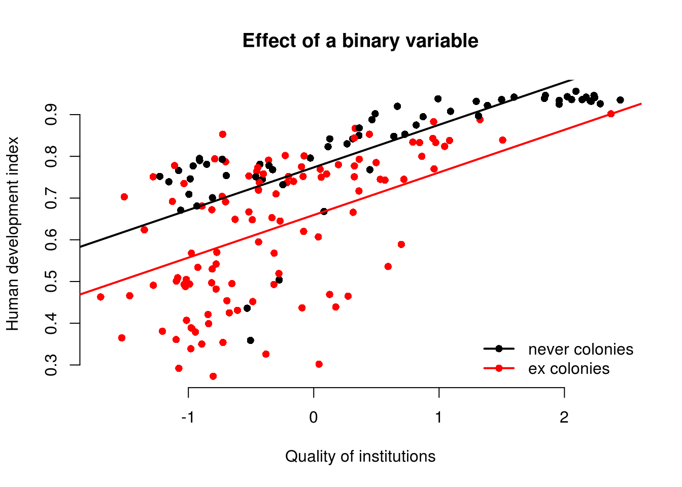
The variable ex_colony is binary. It takes on two values: “never colonies” or “ex colonies”. The first value, “never colonies” is the baseline. When the variable takes on the value “ex colonies”, we end up with an intercept shift. Consequently, we get a second parallel regression line.
model1 <- lm(human_development ~ institutions_quality + ex_colony, data = world_data)
screenreg(model1)
================================
                      Model 1
--------------------------------
(Intercept)             0.77 ***
                       (0.02)
institutions_quality    0.10 ***
                       (0.01)
ex_colonyex colonies   -0.11 ***
                       (0.02)
--------------------------------
R^2                     0.54
Adj. R^2                0.54
Num. obs.             172
RMSE                    0.12
================================
*** p < 0.001, ** p < 0.01, * p < 0.05
6.1.6.1 The Effect of a Dummy Variable
| Ex Colony | Intercept | Slope |
|---|---|---|
| 0 = not a former colony | Intercept + (ex_colonyex colonies * 0)= 0.77 + (-0.11 * 0) = 0.77 |
institutions_quality= 0.10 |
| 1 = former colony | Intercept + (ex_colonyex colonies * 1)= 0.77 + (-0.11 * 1) = 0.66 |
institutions_quality= 0.10 |
To illustrate the effect of a dummy we can access the coefficients of our lm model directly with the coefficients() function:
model_coef <- coefficients(model1)
model_coef
(Intercept) institutions_quality ex_colonyex colonies
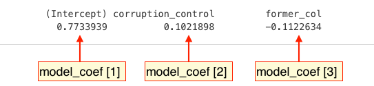
0.7734319 0.1021146 -0.1140925 We can use the square brackets [ ] to access individual coefficients.
To illustrate the effect of a dummy we draw a scatterplot and then use abline() to draw two regression lines, one with ex_colonyex colonies == "never colony" and another with ex_colony == "former colony".
Instead of passing the model as the first argument to abline(), we can just pass the intercept and slope as two separate arguments.
plot(
  human_development ~ institutions_quality,
  data = world_data,
  frame.plot = FALSE,
  col = ex_colony,
  pch = 16,
  xlab = "Quality of institutions",
  ylab = "Human development index",
  main = "Effect of a binary variable"
  )

# the regression line when ex_colony = never colony
abline(model_coef[1], model_coef[2], col = 1, lwd = 2)

# the regression line when ex_colony = ex colony
abline(model_coef[1] + model_coef[3], model_coef[2], col = 2, lwd = 2)

# add a legend to the plot
legend(
  "bottomright",
  legend = levels(world_data$ex_colony),
  col = world_data$ex_colony,
  lwd = 2,   # line width = 1 for adding a line to the legend
  pch = 16,
  bty = "n"
  )