3 Description and measurement
3.1 Overview
In the lecture this week, we discuss descriptive statistics and visualisation of data, starting with single variables and then looking at examples with multiple variables.
In seminar this week, we will cover the following topics:
- Calculating variable summaries, tables and correlations
- Working with missing data
- Scatterplots, boxplots, histograms
Before coming to the seminar
Please read:
Chapter 16 (“Measure Your Mission”), especially sections “Measuring the Wrong Outcome or Treatment” and “Strategic Adaptation and Changing Relationships”, in Thinking Clearly with Data (essential)
Sections 2.6, and 3.1 to 3.6, in Quantitative Social Science: An Introduction (recommended)
3.2 Seminar
Is a state’s use of indiscriminate violence associated with insurgent attacks? In today’s seminar, we will analyse the relationship between indiscriminate violence and insurgent attacks using data about Russian artillery fire in Chechnya from 2000 to 2005. The data in this exercise is based on Lyall, J. 2009. “Does Indiscriminate Violence Incite Insurgent Attacks?: Evidence from Chechnya.”. You can download the data by clicking on the link above.
The names and descriptions of variables in the data file chechen.csv are
| Name | Description |
|---|---|
village |
Name of village |
groznyy |
Variable indicating whether a village is in Groznyy (1) or not (0) |
fire |
Whether Russians struck a village with artillery fire (1) or not (0) |
deaths |
Estimated number of individuals killed during Russian artillery fire or NA if not fired on |
preattack |
The number of insurgent attacks in the 90 days before being fired on |
postattack |
The number of insurgent attacks in the 90 days after being fired on |
Note that the same village may appear in the dataset several times as shelled and/or not shelled because Russian attacks occurred at different times and locations.
Now load the data using the read.csv() function:
Question 1
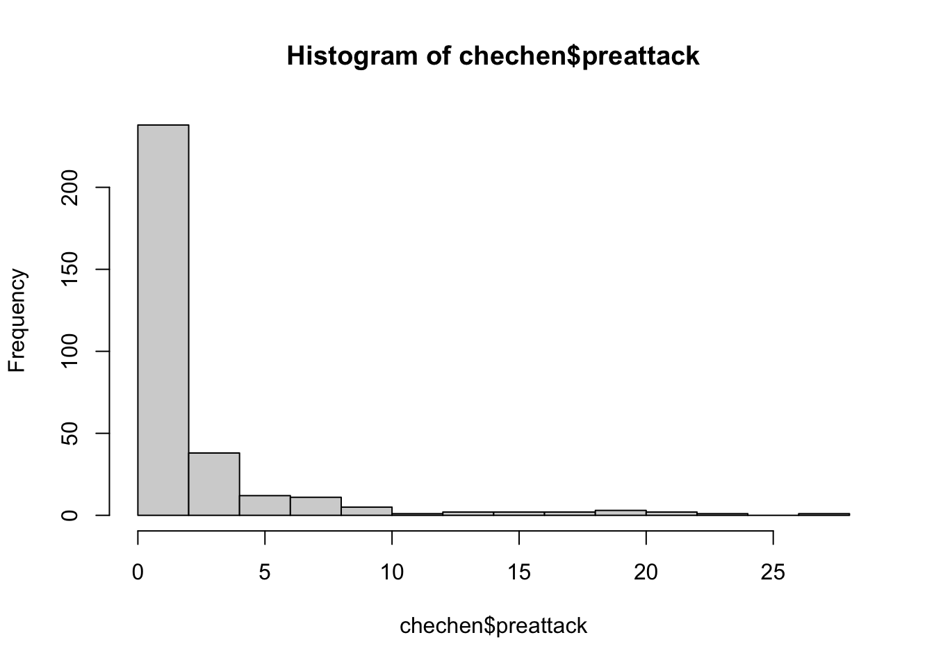
For this question, we will learn to use the summary() function, which provides basic summary statistics for one or more variables. You could also use the summary() function on the entire data frame chechen to get summaries of every variable at once. Depending on whether the variable is interval level or nominal/ordinal, you will get a different looking summary:
##    Min. 1st Qu.  Median    Mean 3rd Qu.    Max.
## 0.00000 0.00000 0.00000 0.06289 0.00000 1.00000## Length Class Mode
## 318 character characterUsing the summary() function, answer the following questions:
- What are the mean and median values of the variables
preattackandpostattack? - What are the maximum and minimum values of the variables
preattackandpostattack? - How many missing values does the variable
deathshave?
Reveal answer
##    Min. 1st Qu.  Median    Mean 3rd Qu.    Max.
##   0.000   0.000   0.000   2.132   2.750  27.000
##    Min. 1st Qu.  Median    Mean 3rd Qu.    Max.
##   0.000   0.000   0.000   1.774   2.000  22.000
##    Min. 1st Qu.  Median    Mean 3rd Qu.    Max.    NA's
## 0.000 0.000 0.000 1.667 1.500 34.000 159- The means of
preattackandpostattackare 2.132 and 1.774 insurgent attacks respectively, and the medians are both 0 insurgent attacks. - The minimum is 0 in both variables and 27 and 22 insurgent attacks in
preattackandpostattack, respectively. - There are 159 missing values in the variable
deaths.
Alternatively, you could use the following commands to find out the same things:
# 1.
mean(chechen$preattack)
mean(chechen$postattack)
median(chechen$preattack)
median(chechen$postattack)

# 2.
range(chechen$preattack)
range(chechen$postattack)

# 3.
table(is.na(chechen$deaths))
## [1] 2.132075
## [1] 1.773585
## [1] 0
## [1] 0
## [1] 0 27
## [1] 0 22
##
## FALSE TRUE
## 159 159Note that you could have answered these questions with some other functions that you learned over the last couple of weeks. Have another look at the lecture materials and previous seminars to find these. You may notice that, for numeric variables, the summary() command only gives the first and third quartile (i.e. the 25th and 75th percentile). We will now use one of the new functions we introduced in the lecture to find out more about the distribution of variables. For instance the quantile() function:
##   0%  25%  50%  75% 100%
## 0 0 0 2 22## 5% 95%
## 0.00 9.15Using the quantile() function, answer the following questions:
- What is the 80\(^{th}\) percentile value of the variable
deaths? (Beware of the missing values! Hint: usena.rm=T)` - What is the interquartile range of the variable
preattack?
Reveal answer
## 80%
## 2- The 80th percentile value of
deathsis 2.
##  75%
## 2.75- The interquartile range of the variable
preattackis 2.75 insurgent attacks
Question 2
Last week we used the function table() to get absolute frequencies for some variable combinations. We can translate absolute frequencies into proportions (i.e. relative frequencies) using the prop.table() command:
##
##              0          1
##   0 0.45911950 0.47798742
##   1 0.04088050 0.02201258
By default, the prop.table command calculates proportions of the entire table. Frequently it is useful to just calculate these within rows or columns. We can do this by adding a comma and either 1 if we want to calculate proportions by row or 2 if we want to calculate proportions by column. Here, we want to calculate proportions by row:
##
##             0         1
##   0 0.4899329 0.5100671
## 1 0.6500000 0.3500000##
## 0 1
## 0 0.91823899 0.95597484
## 1 0.08176101 0.04402516Use the prop.table() function shown above to answer the following questions:
- Among the villages located in Groznyy, what proportion was shelled?
- Among the villages that were shelled, what proportion was not located in Groznyy?
- What is the proportion of villages that were shelled, irrespective of whether they are located in Groznyy or not? (Hint: Use
prop.table(table())for only one variable.)
Reveal answer
- The proportion of villages in Groznyy that were shelled is 0.35.
- The proportion of the shelled villages that are not located in Groznyy is 0.96.
##
##   0   1
## 0.5 0.5- The proportion of shelled villages is 0.5.
Question 3
As we saw above, the variable deaths has missing values, which makes sense as there can be not causalities from the Russians’ attack where there was not Russian attack. You can see this immediately if you use the head() command on the data set.
## [1] NA 0 34 NA NA 0You cannot use the operator == to test for the value NA in R. For example, the command chechen$deaths == NA will not tell you which observations are NA for the variable chechen$deaths, but will simply return all NA values. To identify which observations have NA values, you must use the is.na() function.
## [1] TRUE FALSE FALSE TRUE TRUE FALSECombining the commands is.na() and prop.table(), check if the missing values are indeed only in places where there was no Russian attack.
Reveal answer
##
##     FALSE TRUE
##   0   0.0  0.5
## 1 0.5 0.0deaths are were there was no Russian shelling and all non-missing values are were there was Russian shelling.
Question 4
Let’s now make some visualisations at the distribution of insurgent attacks before and after the Russian shelling, and how it differs between those villages who were shelled and those who were not. In the lecture, we used the commands boxplot() and hist(). For example, you could run:
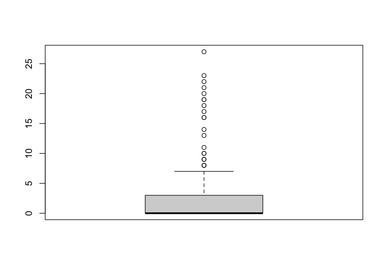
Using these commands, produce the following plots, making sure to add some proper axis labels:
- A histogram of the variable
postattack. Comment on one thing you find noteworthy about the distribution of the data. - A boxplot of the variable
postattack. Briefly discuss what the boxplot tells you that the histogram does not. - Two boxplots of the variable
postattackfor those villages that were struck by artillery fire and those that were not. (Hint:boxplot(variable1 ~ variable2, data = data_name))
Reveal answer
hist(chechen$postattack,
     main = "Histogram of post-shelling insurgency",
     xlab = "Number of post-shelling insurgent attacks")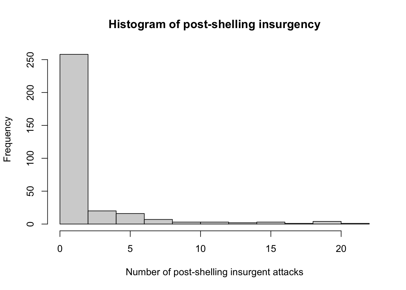
We notice from the histogram that the values of post-shelling attacks is positively skewed, or skewed to the right this means that most villages had few post-shelling insurgency attacks, while a small number of villages had a large number of post-shelling insurgency attacks.
boxplot(chechen$postattack,
     main = "Boxplot of post-shelling insurgency",
     ylab = "Number of post-shelling insurgent attacks")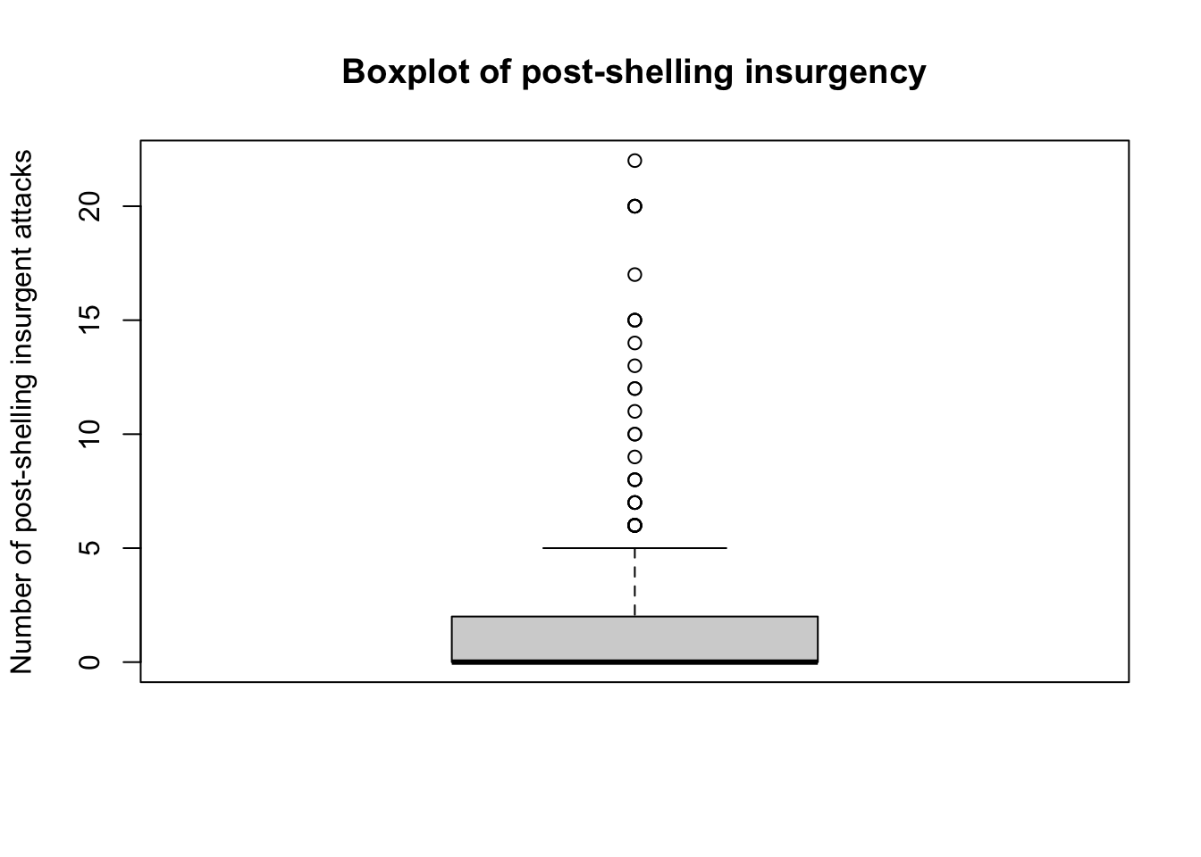
The boxplot allows us to easily see the median and middle 50 per cent of values for the number of post-shelling insurgency attacks, as well as show outliers.
boxplot(chechen$postattack~chechen$fire,
     main = "Boxplot of post-shelling insurgency and artillery fire",
     xlab = "Struck by artillery fire",
     names = c("no", "yes"),
     ylab = "Number of post-shelling insurgent attacks")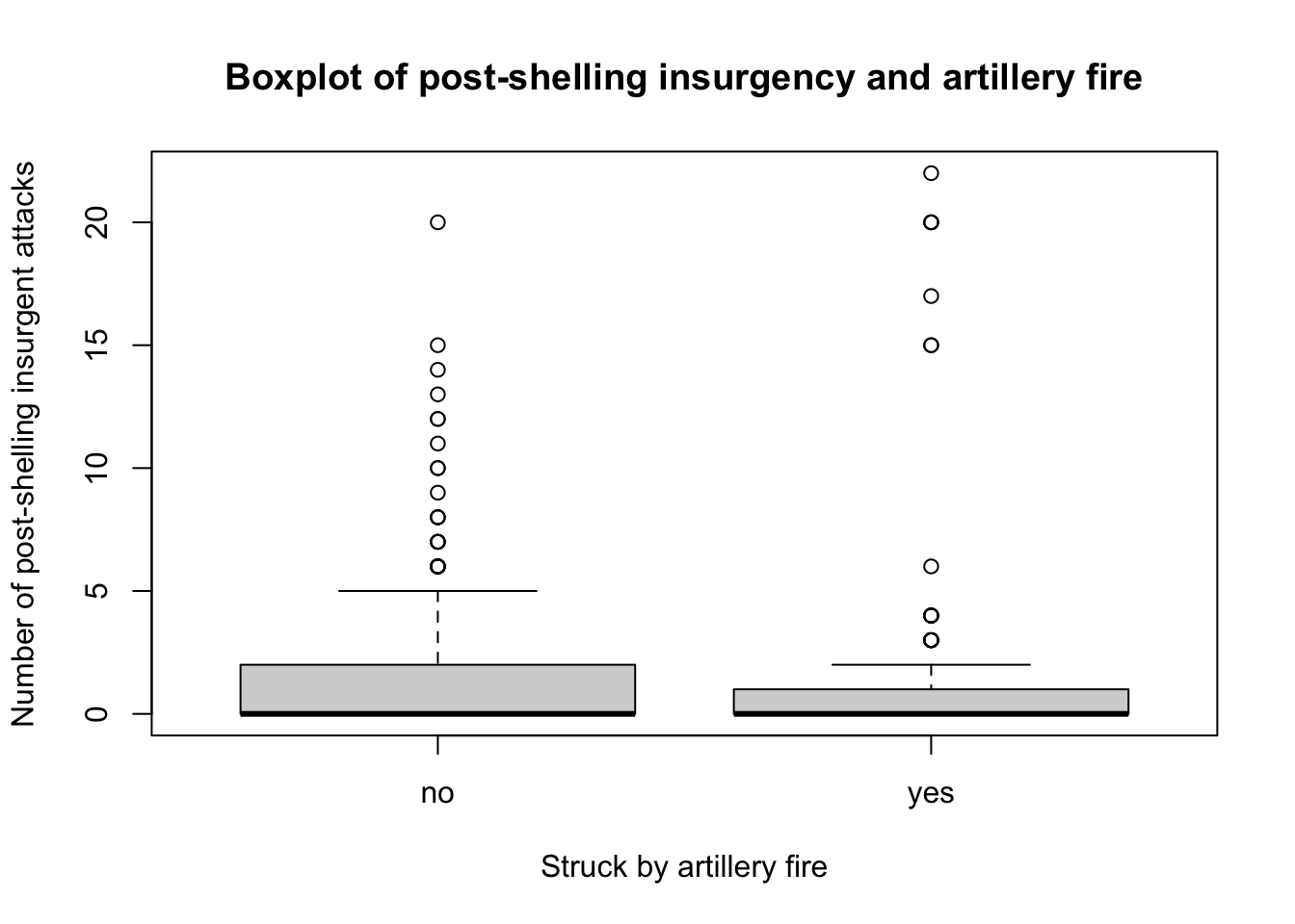
We notice that the median for the number of post-shelling insurgency attacks is similar whether or not a village was struck by artillery file. Looking at the inter-quartile ranges, we notice that there is more variation among villages that were not struck by artillery fire. We can also see that there are a number of outliers for both boxplots.
3.3 Homework
The data for this week’s homework is the same as we used in the seminar last week. Use the read.csv() function as we did in class:
Question 1
Define new variables called
missing_t1,missing_t2, etc that tell us for all of the post-treatment waves which observations have missing data in these (i.e., for which observations tolerance was not recorded).Use
table()andprop.tableto assess whether a respondent going missing in later waves was associated with whether they were assigned to treatment.Calculate the mean level of baseline wave tolerance among those who were missing in wave 1, and those who were not missing in wave 1. Why might it matter whether these are different?
Reveal answer
transphobia$missing_t1 <- is.na(transphobia$tolerance.t1)
transphobia$missing_t2 <- is.na(transphobia$tolerance.t2)
transphobia$missing_t3 <- is.na(transphobia$tolerance.t3)
transphobia$missing_t4 <- is.na(transphobia$tolerance.t4)

prop.table(table(transphobia$treat_ind,transphobia$missing_t1),1)
prop.table(table(transphobia$treat_ind,transphobia$missing_t2),1)
prop.table(table(transphobia$treat_ind,transphobia$missing_t3),1)
prop.table(table(transphobia$treat_ind,transphobia$missing_t4),1)

mean(transphobia$tolerance.t0[transphobia$missing_t1 == TRUE])
mean(transphobia$tolerance.t0[transphobia$missing_t1 == FALSE])
##
## FALSE TRUE
## 0 0.8809524 0.1190476
## 1 0.8305085 0.1694915
##
## FALSE TRUE
## 0 0.8015873 0.1984127
## 1 0.7796610 0.2203390
##
## FALSE TRUE
## 0 0.8214286 0.1785714
## 1 0.7669492 0.2330508
##
## FALSE TRUE
## 0 0.8055556 0.1944444
## 1 0.7288136 0.2711864
## [1] -0.2131327
## [1] 0.02415432Respondents assigned to receive the treatment were more likely to be missing in all subsequent waves of the survey. The treatment effect on missingness varies between 2 and 7 percentage points across the different waves.
Respondents who went missing after the first wave of the survey were substantially less tolerant in the baseline survey (0.23 points on the baseline tolerance scale). This is potentially a problem because if the treatment causes the less tolerant people to opt out of the subsequent waves of the survey, we might worry that any difference in tolerance between those who were treated and those who were not in subsequent waves is not because the treatment made people more tolerant, but instead because the treatment made the intolerant people drop out of the survey.
Question 2
Subset the entire data set to use only the observations which were not missing at t1. Then construct a scatterplot with age on the x-axis and tolerance_t0 on the y-axis, using the observations for which treatment.delivered == TRUE. Calculate the correlation between age and tolerance_t0. Now, generate the same plot and correlation using tolerance_t1 for the same observations. What does the change or lack of change in this correlation tell us about the likely effect of the treatment on people of different ages?
Reveal answer
transphobia2 <- transphobia[transphobia$missing_t1 == FALSE,]

par(mfrow=c(1,2))
plot(transphobia2$vf_age[transphobia2$treatment.delivered == TRUE],
     transphobia2$tolerance.t0[transphobia2$treatment.delivered == TRUE],
     main="Baseline Tolerance")
plot(transphobia2$vf_age[transphobia2$treatment.delivered == TRUE],
     transphobia2$tolerance.t1[transphobia2$treatment.delivered == TRUE],
     main="Post-Treatment Wave 1 Tolerance")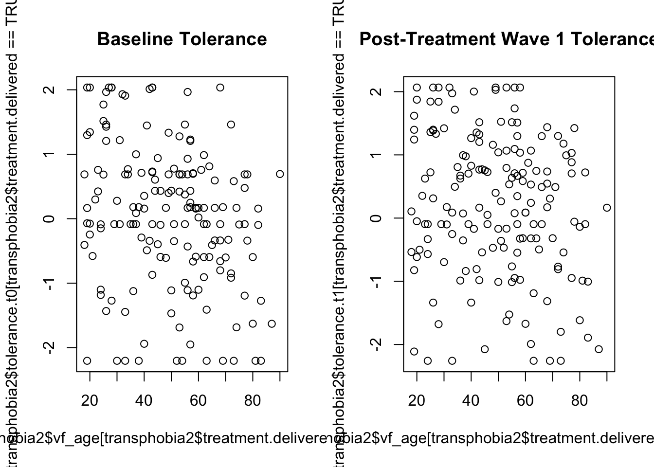
cor(transphobia2$vf_age[transphobia2$treatment.delivered == TRUE],
     transphobia2$tolerance.t0[transphobia2$treatment.delivered == TRUE])

cor(transphobia2$vf_age[transphobia2$treatment.delivered == TRUE],
     transphobia2$tolerance.t1[transphobia2$treatment.delivered == TRUE])
## [1] -0.2686877
## [1] -0.1847027The correlation between age and tolerance is negative in the baseline wave. This indicates that older people tend to have lower measured tolerance than younger people. It appears that the treatment reduces the magnitude of this negative correlation between age and transphobia, which indicates that the effect of the treatment was more positive on older people than on younger people.
Question 3
One possibility is that the treatment could have been polarising, which is to say that it might not just change the average level of tolerance but also change the degree of dispersion in tolerance. Put differently, even if some people responded positively, others might have responded negatively. If we look at the histograms for tolerance.t1 among those assigned to treatment (treat_ind == 1) versus those who were not (treat_ind == 0), we see some evidence that this could be the case:
par(mfrow=c(2,1))
hist(transphobia$tolerance.t1[transphobia$treat_ind == 0])
hist(transphobia$tolerance.t1[transphobia$treat_ind == 1])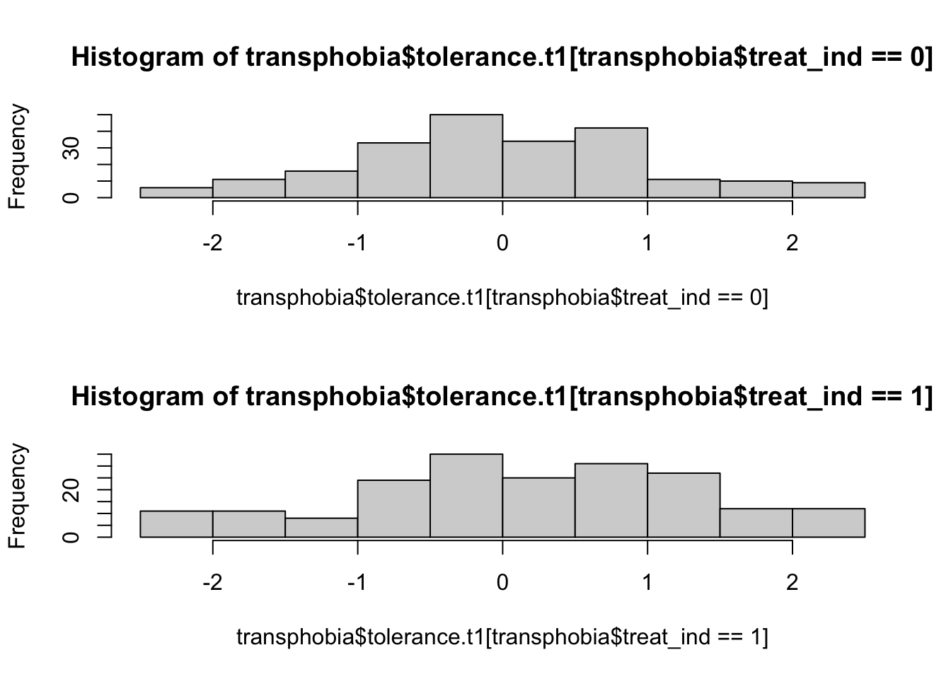
Note that the par() command above is used to set graphical parameters, in this case to put two plots in a 2 row x 1 column grid (mfrow=c(2,1)), and then to return to the original single plot setting (mfrow=c(1,1)). The par() command has a bewildering array of options which you can look up in its help file.
The command sd() calculates the standard deviation for set of values in R.
Calculate the difference in standard deviations between treatment and control groups in wave 0 and in wave 1.
Reveal answer
(sd(transphobia$tolerance.t0[transphobia$treat_ind == 1], na.rm=TRUE) -
  sd(transphobia$tolerance.t0[transphobia$treat_ind == 0], na.rm=TRUE))

(sd(transphobia$tolerance.t1[transphobia$treat_ind == 1], na.rm=TRUE) -
    sd(transphobia$tolerance.t1[transphobia$treat_ind == 0], na.rm=TRUE))
## [1] 0.114463
## [1] 0.1405Question 4
How similar are individuals’ tolerance scores across different waves?
We can look at the relationship between the two waves visually by using a scatter plot with the tolerance score for one wave on the x-axis, and the tolerance score for another wave on the y-axis:
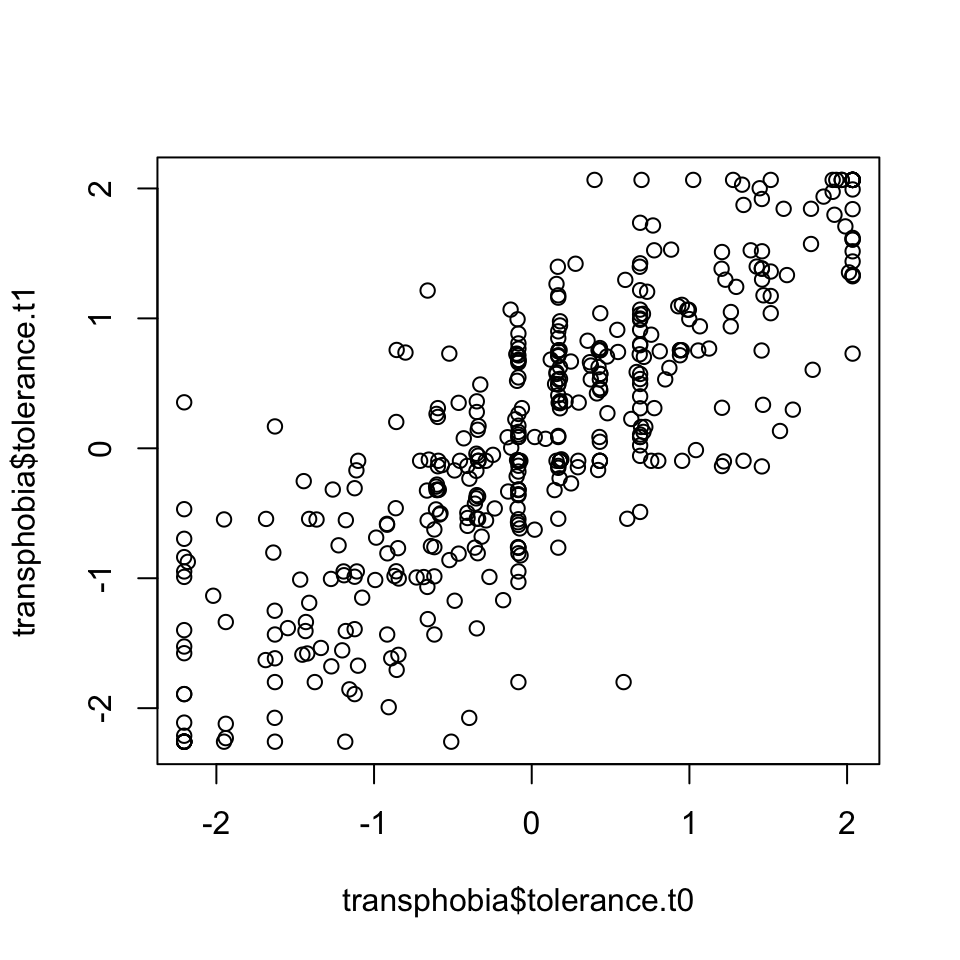
Clearly these are positively correlated. We can calculate the correlation coefficient \(\rho\) with the command:
## [1] 0.8290495- Create scatter plots to look at the relationship between subsequent waves.
- What is the correlation coefficient between the waves?
Reveal answer
1.
We can look at the relationship between the next waves visually by using a scatter plots. As we are making three scatter plots, we can use the par() command for three plots in a 3 row x 1 column grid (mfrow=c(3,1)).
par(mfrow=c(3,1))
plot(transphobia$tolerance.t1,transphobia$tolerance.t2)
plot(transphobia$tolerance.t2,transphobia$tolerance.t3)
plot(transphobia$tolerance.t3,transphobia$tolerance.t4)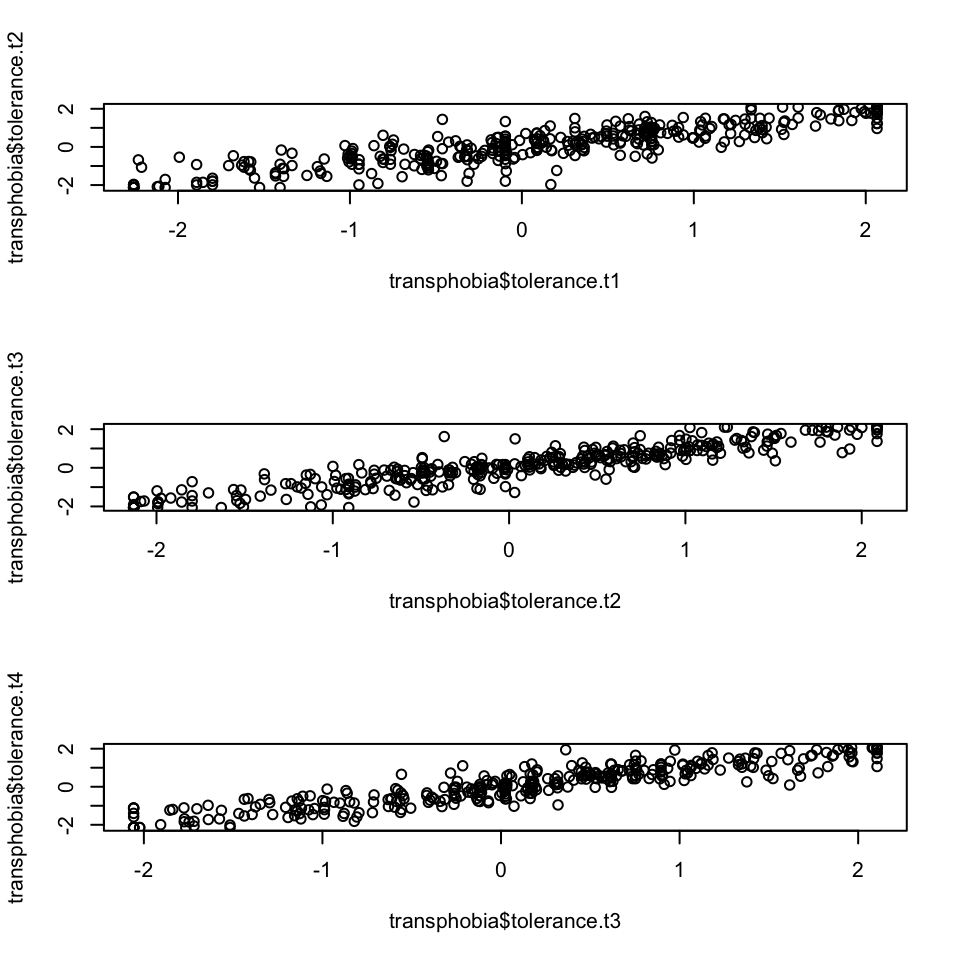
2.
We can calculate the correlation coefficient between the waves using the cor() function:
cor(transphobia$tolerance.t1,transphobia$tolerance.t2,use="pairwise.complete.obs")
cor(transphobia$tolerance.t2,transphobia$tolerance.t3,use="pairwise.complete.obs")
cor(transphobia$tolerance.t3,transphobia$tolerance.t4,use="pairwise.complete.obs")
## [1] 0.8749074
## [1] 0.9175045
## [1] 0.9128597