8 Unsupervised Scale Measurement I: Interval-Level Indicators
Topics: Learning scale weights from sample covariation. Principle Components Analysis (PCA). Exploratory Factor Analysis (EFA).
Required reading:
- Chapter 11, Pragmatic Social Measurement
Further reading:
Theory
- James et al. (2013), Ch 10-10.2
- Everitt and Hothorn (2011), Ch 3 & 5
- Bartholomew et al. (2008), Ch 5 & 7
Applications
8.1 Seminar
In this week’s assignment, we are going to look at a set of variables describing the economic characteristics of UK (excluding Northern Ireland) parliamentary constituencies around 2017-2019 (the dates of the source data vary a bit in terms of year).
This data file has 8 variables
ONSConstID- Office for National Statistics Parliamentary Constituency IDConstituencyName- Constituency NameHouseWageRatio- Ratio of House Prices to WagesUnempConstRate- Unemployment RateUnempConstRateChange- Unemployment Rate Change since 2010WageMedianConst- Median Wagesocial_mobility_score- Social Mobility Indexdeprivation_index_score- Social Deprivation Index
There is some missing data for some of these variables for Scotland and Wales, so we will exclude those. Use the following command to remove them from the data:
econ_vars <- read.csv("4_data/week-7-econ-vars.csv")
econ_vars <- econ_vars[is.element(substr(econ_vars$ONSConstID,1,1),c("E")),]
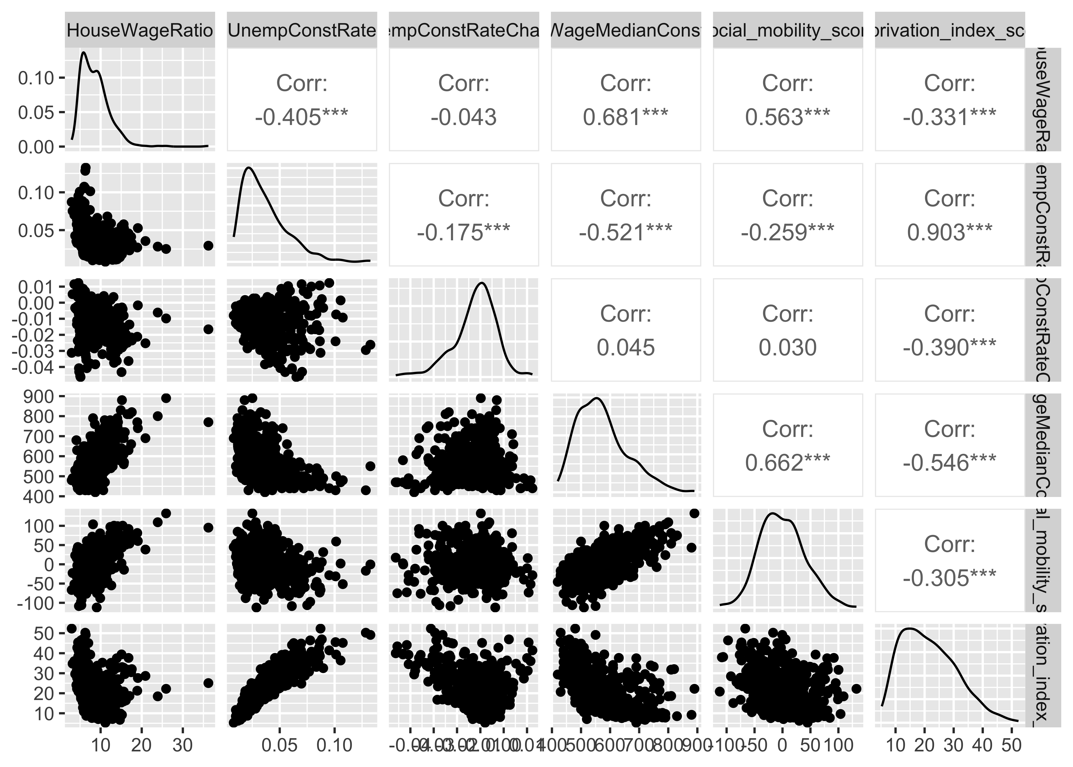
- Assess the correlations between the six economic variables in the data set. Which two economic variables are most highly correlated with one another at the constituency level? Which variable is least correlated with the others at the constituency level? Hint: You can use
cor()to get the pairwise correlations andpairs()for the plot or, better yet, useggpairs()from theGGallypackage to do both in one!

The two most highly correlated variables are the unemployment rate and the deprivation index.
The change in the unemployment rate since 2010 is barely correlated with any of the other variables. This is very likely to be because the places that are poor or affluent tend to stay that way over time. As a result, there is no reason to expect that the change in unemployment will be associated with whether a place is currently relatively poor/affluent.
- Use the command
pcafit <- prcomp(econ_vars[,4:9],scale=TRUE)to calculate the principal components of these six economic variables. Then examine the objectpcafitdirectly and also throughsummary(pcafit). Which variable is has the smallest (magnitude) “loading” on the first principal component? How does this relate to your answer in Q1?
## Standard deviations (1, .., p=6):
## [1] 1.7666732 1.1652675 0.8889118 0.6460604 0.5037648 0.2442953
##
## Rotation (n x k) = (6 x 6):
##                                PC1        PC2        PC3         PC4
## HouseWageRatio          -0.4159756 -0.3771834 0.05947919  0.75825898
## UnempConstRate           0.4548338 -0.3205344 0.47247017  0.03825962
## UnempConstRateChange    -0.1302040  0.6051598 0.73740722  0.20929981
## WageMedianConst         -0.4881757 -0.2380995 0.06771818 -0.04389975
## social_mobility_score   -0.3867713 -0.3868244 0.42061614 -0.59345975
## deprivation_index_score  0.4639288 -0.4271388 0.21900014  0.16016068
##                                 PC5         PC6
## HouseWageRatio          -0.30144653  0.12382456
## UnempConstRate           0.22721114  0.64348050
## UnempConstRateChange     0.02493771 -0.16920649
## WageMedianConst          0.82807063 -0.11304521
## social_mobility_score   -0.41158724 -0.04752233
## deprivation_index_score 0.04216830 -0.72590075## Importance of components:
## PC1 PC2 PC3 PC4 PC5 PC6
## Standard deviation 1.7667 1.1653 0.8889 0.64606 0.5038 0.24430
## Proportion of Variance 0.5202 0.2263 0.1317 0.06957 0.0423 0.00995
## Cumulative Proportion 0.5202 0.7465 0.8782 0.94776 0.9900 1.00000The variable with the smallest magnitude loading on PC1 is the change in the unemployment rate. This is what we would expect given that we previously found it had very low correlations with all of the other variables. A principal component that predicts as much variation in the other variables as possible cannot possibly predict much variation in a variable that is poorly correlated with all other variables.
- Construct screeplots using either the
type="barplot"or thetype="lines"options of thescreeplot()command. Given this and the output ofsummary(pcafit)above, is it clear how many dimensions are needed to describe these data well?

The first principal component “explains” about half the variance (0.52) and the second principal component explains about a quarter (0.23). This is a somewhat ambiguous case, each component explains about half as much variation as the previous one. You could certainly make a credible argument for either one or two principal components providing a good summary of the data. Depending on the application of interest, you might think that a single dimension explaining half the variation was a pretty good summary or that two dimensions explaining three quarters of the variation was preferable.
- Check that the signs of the loadings for PC1 for each variable in the model. For each variable, write sentences of the form “[The ratio of home prices to wages] are [positive/negatively] correlated with the first principal component”. Do these all make sense collectively? You could also try writing a sentence of the form: “Places that are high on the first principal component are [high/low] in the house to wage ratio, [high/low] in unemployment,…” What does this tell us about what the first principal component is measuring?
- The ratio of home prices to wages is negatively correlated with the first principal component
- The unemployment rate is positively correlated with the first principal component
- Recent changes in the unemployment rate are negatively correlated with the first principal component
- Median wage is negatively correlated with the first principal component
- Social mobility is negatively correlated with the first principal component
- Deprivation is positively correlated with the first principal component
If you put these together, the general tendency is for attributes of less economically successful places to be positively correlated with the first principal component: lower house prices, higher unemployment, lower wages, lower social mobility and higher deprivation. You could argue about whether this is capturing a concept that should be understood as “economic success” or “affluence” or something else similar. The one slight mismatch is the unemployment change variable, which is weakly negatively associated with the first principal component. As we noted before, this variable perhaps does not belong in this analysis because it describes changes over time rather than levels.
- Are you able to identify what PC2 is capturing?
PC2 is positively associated with unemployment rate changes and negatively associated with everything else. It would appear this is heavily a factor for capturing unemployment rate changes, which we have already seen are mostly uncorrelated with the over variables. It does capture a bit of additional variation from the other variables, but not in a way that we’re able to make much sense of! One possible, but very speculative, interpretation is that those who score low on PC2 are more unequal places (high median wage but also high unemployment and social deprivation).
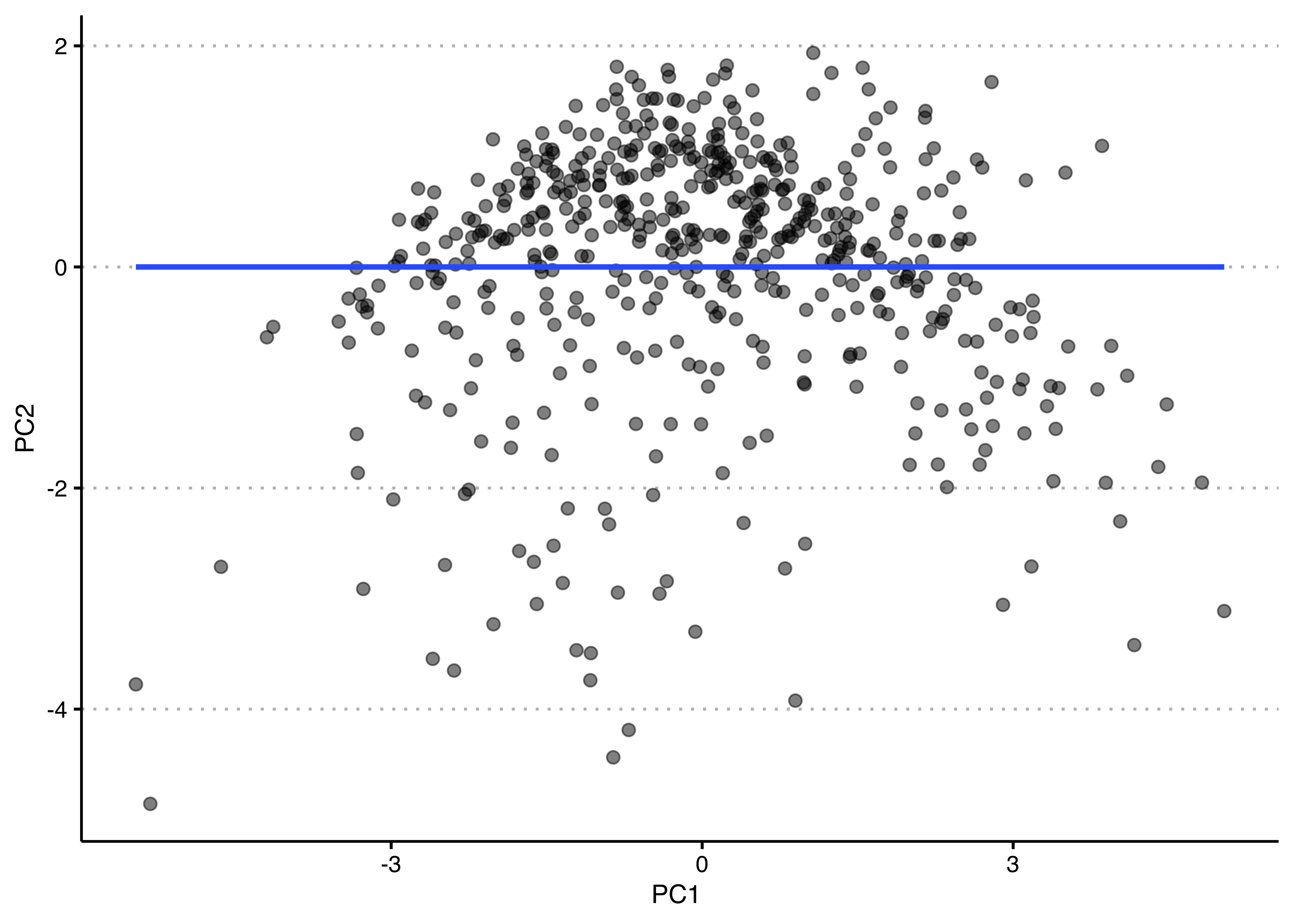
You could also plot the two principle components against each other as such. Notice how the regression line is completely flat? It’s because they are - by design - completely uncorrelated.
library(ggplot2)
library(ggthemes)
res <- data.frame(x1 = pcafit$x[,1],x2 = pcafit$x[,2])
ggplot(res, aes(x= x1, y=x2)) +
  geom_point(alpha=.5,size=2) +
  geom_smooth(method = "lm",se=F) +
  xlab("PC1 ") + ylab("PC2") +
  theme_clean() +
  theme(plot.background = element_rect(color=NA))
- Re-do the principal components analysis without the variable that has the smallest magnitude loading on the first principal component. Extract the first principal component from the original analysis with all six variables (using
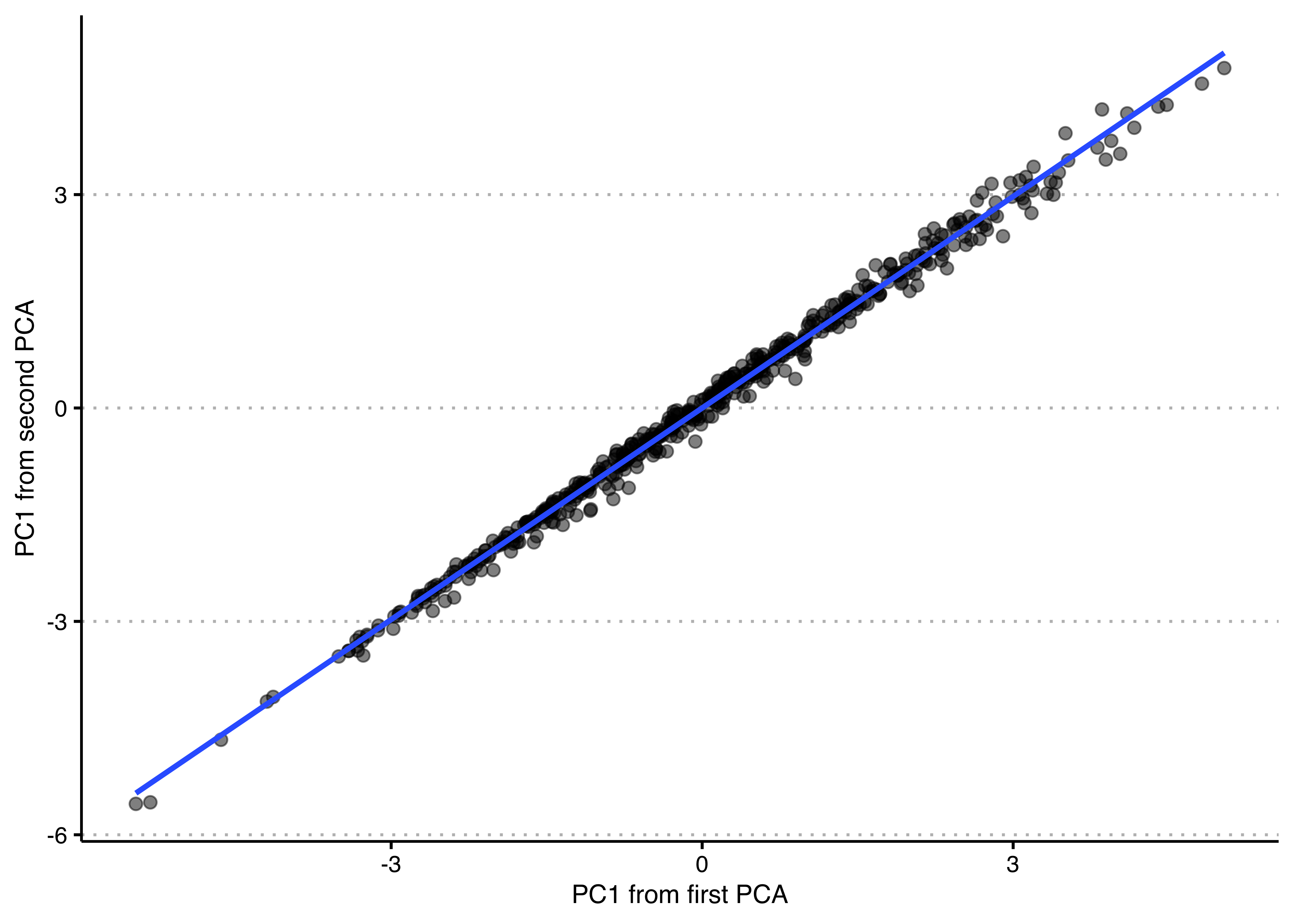
pcafit$x[,1]) and also from this new analysis with five variables. Plot them against one another and check their correlation. Explain why you find what you find.
## Standard deviations (1, .., p=5):
## [1] 1.7565429 1.0658834 0.6638214 0.5041835 0.2891193
##
## Rotation (n x k) = (5 x 5):
##                                PC1        PC2         PC3         PC4
## HouseWageRatio          -0.4294957 -0.3798653 -0.73628018 -0.31772277
## UnempConstRate           0.4531833 -0.5254131  0.07272015  0.20909319
## WageMedianConst         -0.4979047 -0.2271984  0.02627548  0.83039862
## social_mobility_score   -0.3964105 -0.5029322  0.64941606 -0.40424205
## deprivation_index_score  0.4528885 -0.5244840 -0.17369990  0.04856716
##                                 PC5
## HouseWageRatio          -0.16786763
## UnempConstRate          -0.68524285
## WageMedianConst          0.10109170
## social_mobility_score    0.06902949
## deprivation_index_score 0.69805307## Importance of components:
## PC1 PC2 PC3 PC4 PC5
## Standard deviation 1.7565 1.0659 0.66382 0.50418 0.28912
## Proportion of Variance 0.6171 0.2272 0.08813 0.05084 0.01672
## Cumulative Proportion 0.6171 0.8443 0.93244 0.98328 1.00000library(ggplot2)
library(ggthemes)
res <- data.frame(x1 = pcafit$x[,1],x2 = pcafit2$x[,1])
ggplot(res, aes(x= x1, y=x2)) +
geom_point(alpha=.5,size=2) +
geom_smooth(method = "lm",se=F) +
xlab("PC1 from first PCA") + ylab("PC1 from second PCA") +
theme_clean() +
theme(plot.background = element_rect(color=NA))
## [1] 0.9969929The relative loadings on the five remaining variables are nearly identical to their previous values. The first principal component values for the constituencies are very nearly identical as well, correlated at over 0.99. Very little has changed because the variable we omitted was very weakly correlated with the others. Put differently, changes in unemployment are not really closely related to affluence or economic success of constituencies, so they are a poor indicator of that more general concept. The other five indicators tend to go together much more strongly.
- Now, let’s run a factor model instead. As we ended up looking at two principal components, let’s fit a model with two factors, using the code shown below. Have a look at the loadings (i.e. the coefficients) of each factor and compare those two the PCA we did above. Note: The default for
factanalis to not show loadings smaller than 0.1, so if you see some empty cells, that’s why! Further note that you don’t need to additionally specify that the variables should be standardised (or do so yourself beforehand), as teh function does that automatically.
# to show loadings below 0.1, you can use the "cutoff =" argument in print()
print(fafit$loadings, cutoff = 0.01)
##
## Loadings:
## Factor1 Factor2
## HouseWageRatio 0.766 -0.074
## UnempConstRate -0.367 0.829
## UnempConstRateChange -0.079 -0.441
## WageMedianConst 0.870 -0.263
## social_mobility_score 0.732 -0.056
## deprivation_index_score -0.344 0.936
##
## Factor1 Factor2
## SS loadings 2.140 1.838
## Proportion Var 0.357 0.306
## Cumulative Var 0.357 0.663# putting the PC and factor loadings side-by-side
all_coefs <- data.frame(PC1 = round(pcafit$rotation[,1],2), # first PC
F1 = round(fafit$loadings[,1],2), # first factor
PC2 = round(pcafit$rotation[,2],2), # second PC
F2 = round(fafit$loadings[,2],2)) # second factor
all_coefs## PC1 F1 PC2 F2
## HouseWageRatio -0.42 0.77 -0.38 -0.07
## UnempConstRate 0.45 -0.37 -0.32 0.83
## UnempConstRateChange -0.13 -0.08 0.61 -0.44
## WageMedianConst -0.49 0.87 -0.24 -0.26
## social_mobility_score -0.39 0.73 -0.39 -0.06
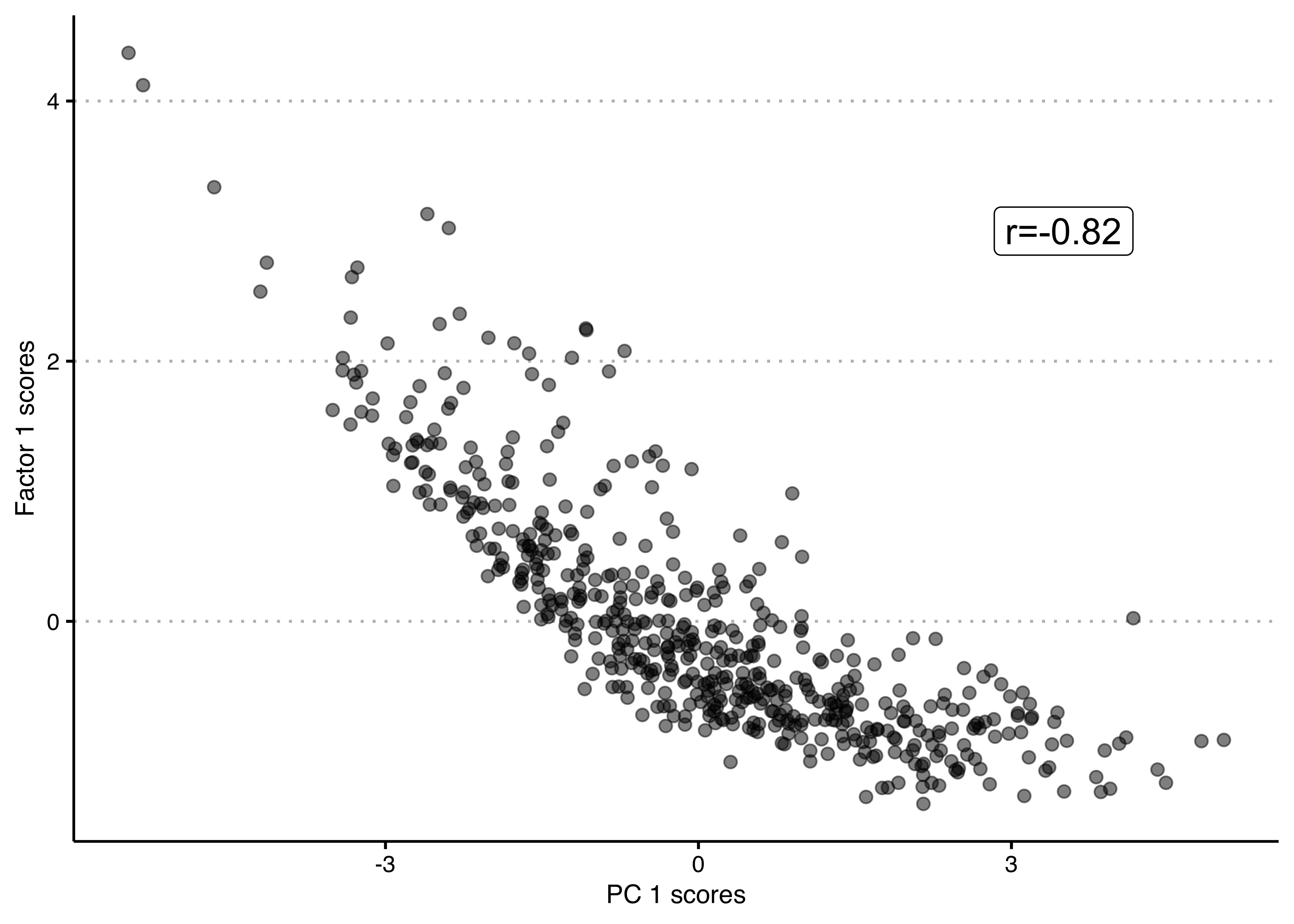
## deprivation_index_score 0.46 -0.34 -0.43 0.94Looking at the loadings on the first factor, we see a very similar pattern than for the first PC above – only with the signs flipped (remember that the sign/direction of a PC or of a factor is entirely arbitrary!) – with a very weak association with the unemployment rate change, negative associations with unemployment rate and deprivation index scores and positive associations with house-wage ratio, median wage and social mobility scores. We can also see that the first PC and the first factor are very similar by plotting the respective scores against each other. Evidently, they are quite highly correlated.
econ_vars$pc1 <- pcafit$x[,1] # first PC scores as new column in data
econ_vars$fa1 <- fafit$scores[,1] # first factor scores as new column in data

ggplot(econ_vars, aes(x = pc1, y = fa1)) +
  geom_point(alpha=.5,size=2) +
  annotate("label", x=3.5, y=3,
           label=paste0("r=",round(cor(econ_vars$pc1, econ_vars$fa1),2)), size=5) +
  xlab("PC 1 scores") + ylab("Factor 1 scores") +
  theme_clean() +
  theme(plot.background = element_rect(color=NA))
The second factor seems to be quite different from the second principal component and again seems to be differentiating between more or less affluent places in a slightly different way than the first factor, with even more weight put on unemployment rate change, unemployment and deprivation and less on the house-wage ratio and social mobility. Remember that factors can be correlated with each other, so it is not unlikely that they might show more similar patterns to each other, than different principal components would.
But more broadly, similarly to the second principal component, the second factor is harder to interpret, which may lead us to question its practical usefulness, even though it does explain 30% of the variance (the first one explains 35%, and together they explain 66% of the total variance, as you can see after the loadings in the code output above).
8.2 Quiz
- When trying to combine several indicators which of the following is not one of the limitations of an additive, equal weight scale?
- It commits us to the idea that the measure m will be increasing for any increase in any of the indicators.
- Equal weighting is often taken as the default strategy, because it is difficult to come up with convincing arguments about why it should be otherwise.
- It treats all indicators as equally important.
- It is only implementable when we have gold-standard training data available to learn how to connect the concept and the indicators.
- What are principal components?
- They are the independent variables that linearly combine to create the observed indicators and each seeks to explain the variation unexplained by the previous principal component.
- They are linear combinations of the observed indicators and each seeks to explain the variation unexplained by the previous principal component.
- They are all uncorrelated with each other and there will always be as many PC’s as there are indicators.
- They can be correlated with each other and there will always be as many PC’s as the analyst chooses.
- Which of the following is not true about principal component analysis?
- The direction of the coefficients and therefore of the resulting PC is arbitrary.
- The order of the resulting PC’s is arbitrary.
- If you use all principal components, you will explain all the variance in the data.
- PCA is sensitive to the scale of the indicators because the scale of a variable determines its variance relative to other variables.
- It is an example of discriminative measurement, as the measurement is the result of combining the indicators (LHS of the equation).
- Which of the following defines discriminative measures?
- It is when a measure assumes that changes in the target concept generate changes in the measure through a direct causal pathway.
- It refers to cases where we use our substantive knowledge of and/or data about the relationship between concept and indicators to connect the two.
- It is when we use theory to derive predictions (hypotheses) which we use to draw conclusions about observations.
- It is when a measure discriminates between different levels of the concept, implying that concept is being defined by the measurement strategy.
- Which of the following does not apply to exploratory factor analysis?
- It is an example of generative measurement because it hypothesises latent dimension which are assumed to cause the observed differences in indicators.
- The latent factors are the result of linear combinations of the observed indicators.
- The observed indicators are the result of a linear function of the latent factors and an uncorrelated error term.
- Even though conceptually different, EFA and PCA will usually result in similar conclusions.